Audemars Piquet Campaign

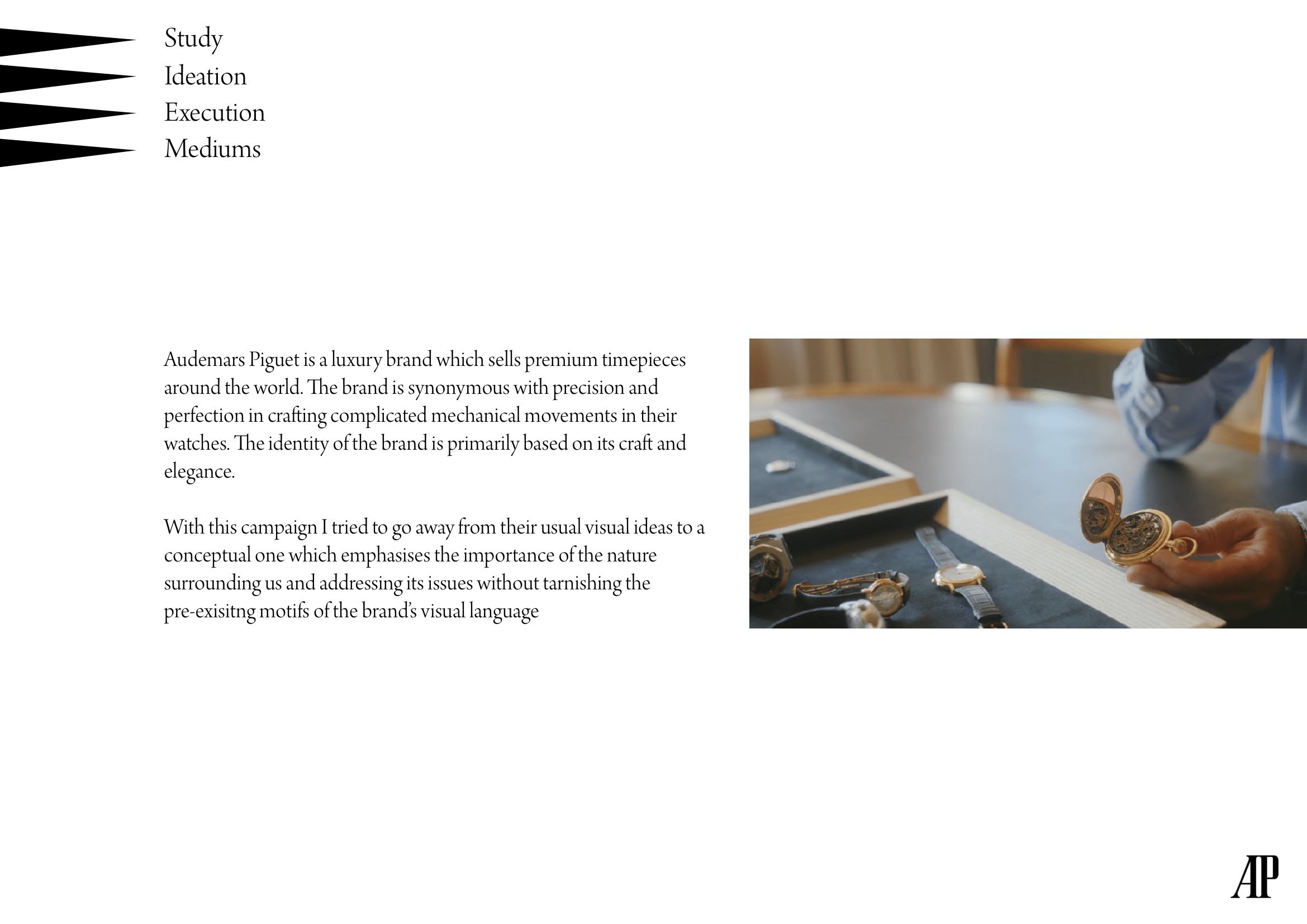
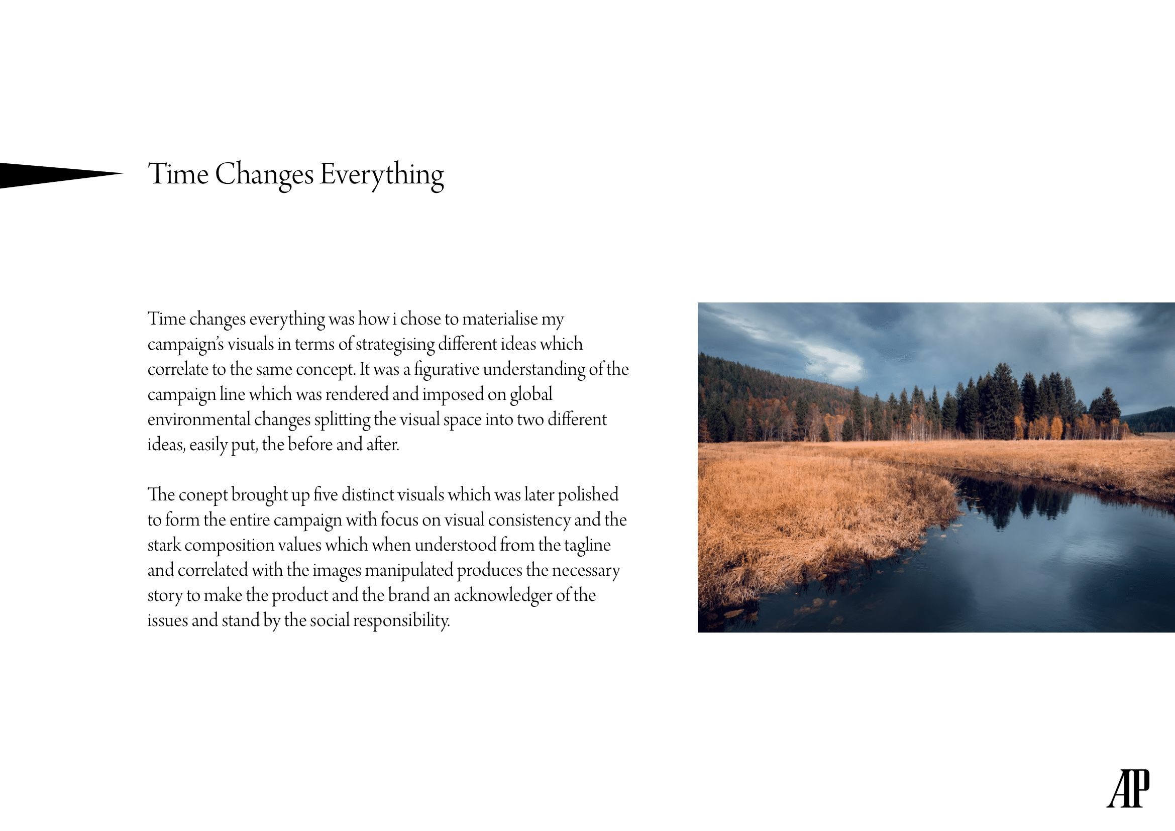
After some research on the visual language that the brand takes to communicate with its demographic I went on to confirm my campaign line. The reason I picked this was because I felt like looking at one definitve rhetoric and approaching that with a bit more background so the campaign is effective and the tone of the communication is set.
Some rough sketches were done as part of ideating the final five visuals for the campaign. Though I had one constraint which is that it should never boast itself of a message or any form of preachiness but at the same time be put the phrae across visually.
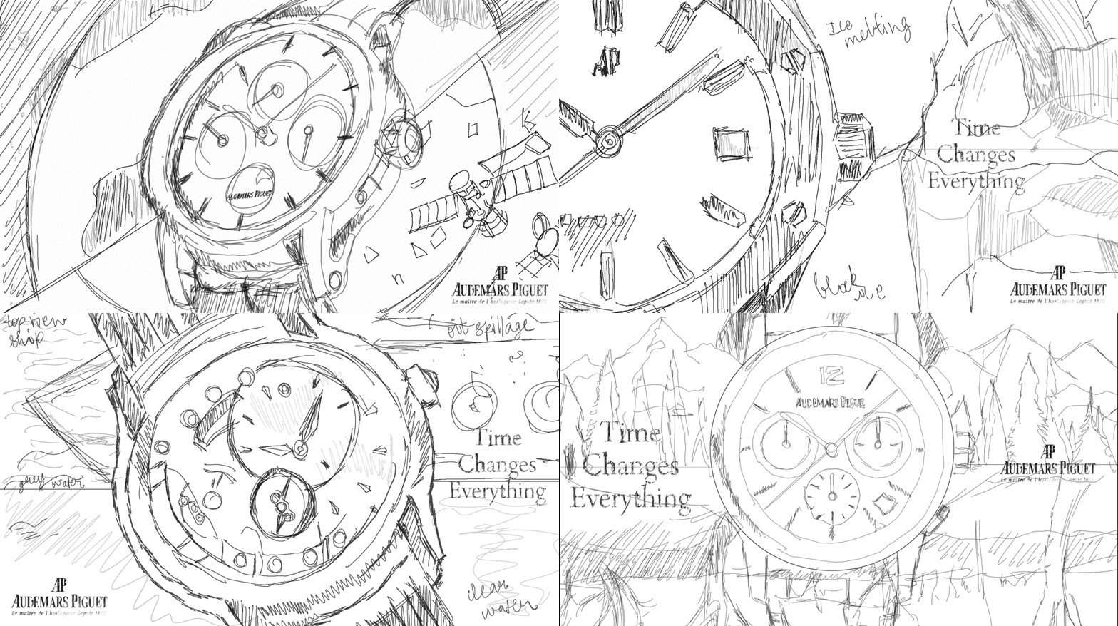
The sketches were then converted and curated into a image series which was processed to liking and then manipulated. To fit the description it is an idea of before and after but put in the background of the object to be sold almost as if the brand is thinking about these factors before putting their product into the soceity.

This rendition puts forth the idea of space pollution and crowding

The glaciers in the farthest background as it approaches the foreground it melts rapidly, there is melted ice to indicate the effect of climate.
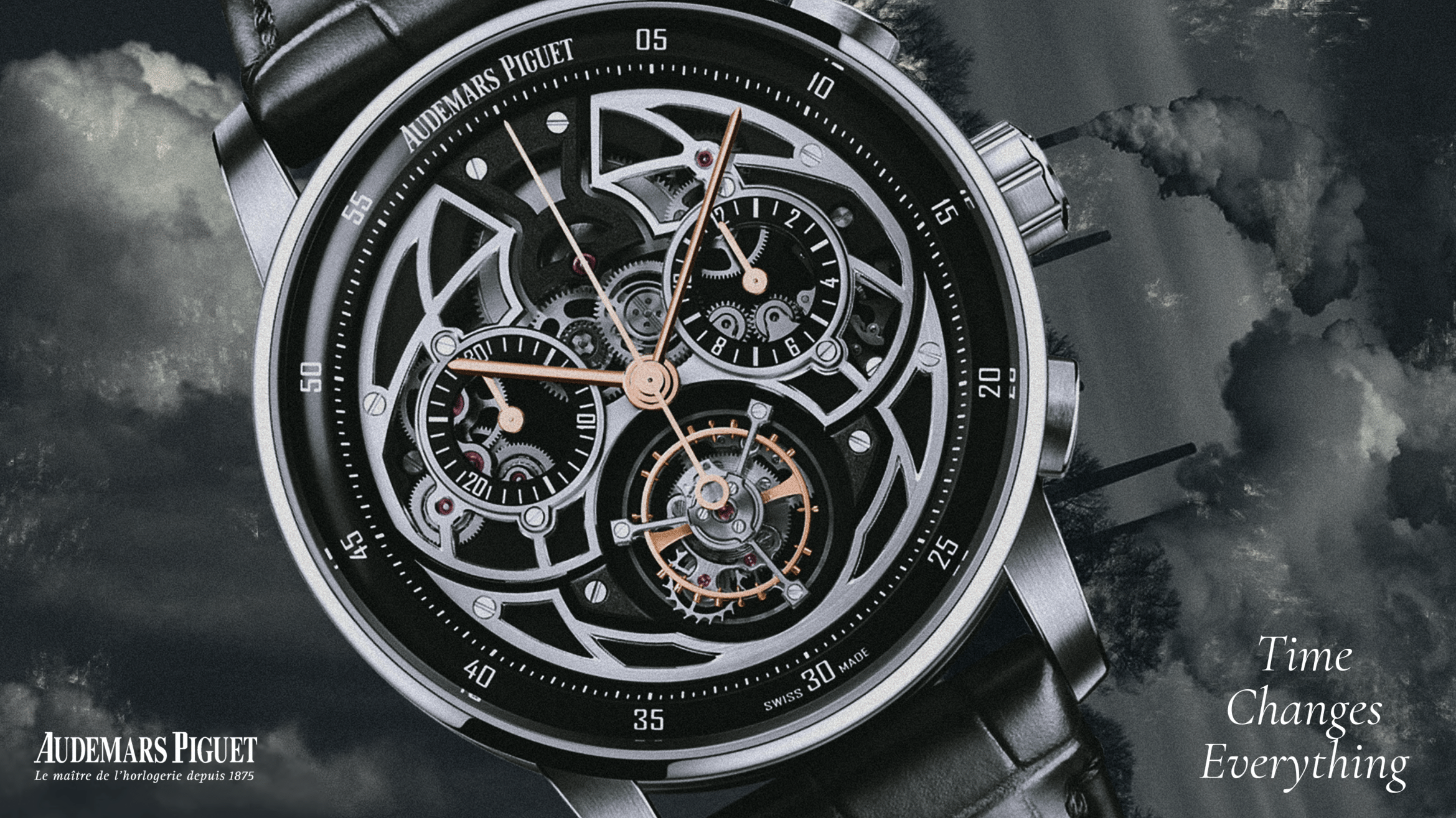
The sky was blue in color, now its black and grey covered in soot

Oil spillage before which the sea of clean the water was clean, the floating oil giving it an image

The thick forest cover on the top as time passes deteriorates due to human activity to end up barren
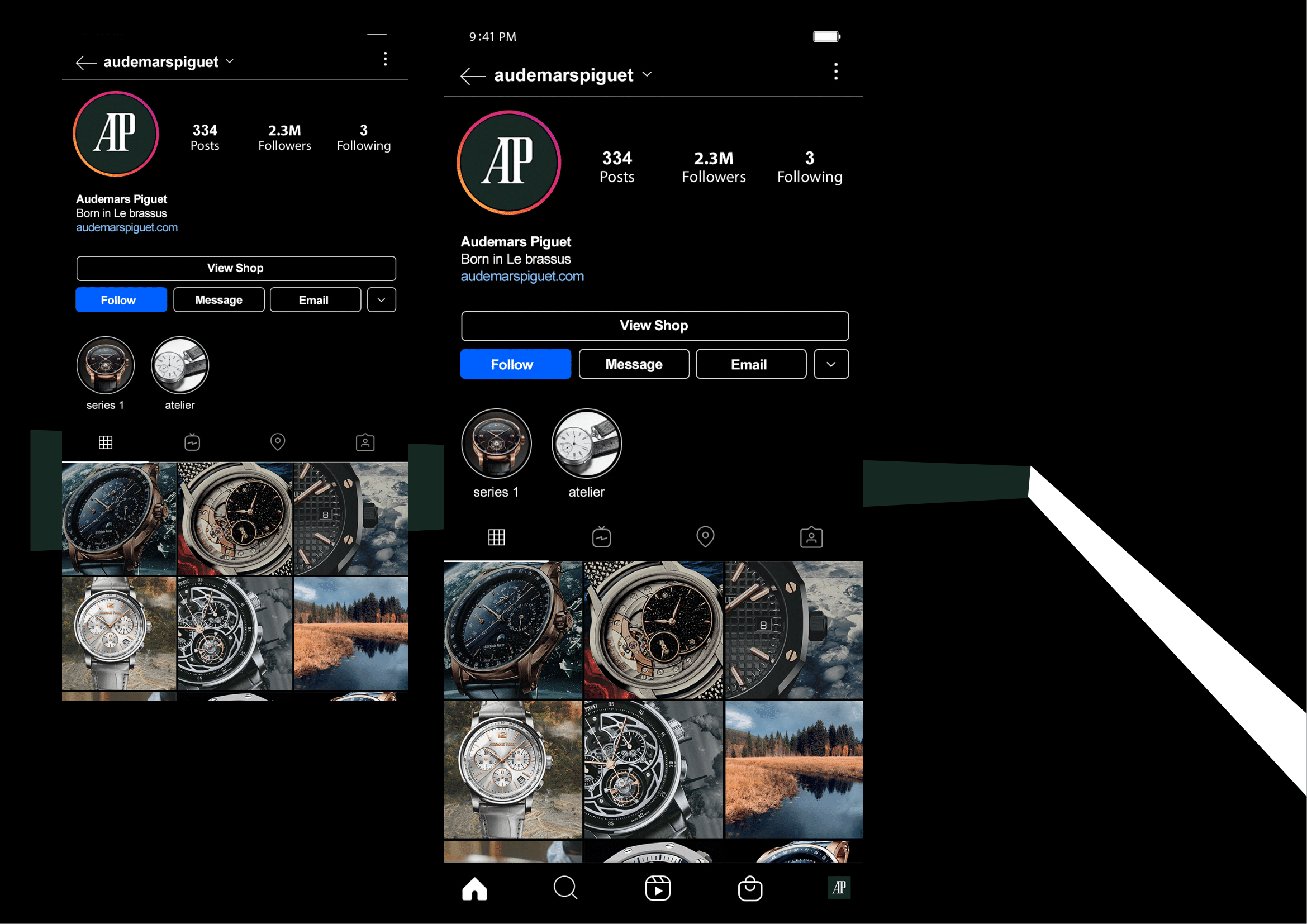
Some applications of the advertising campaign was created to be able to visualize the designs in certain touchpoints.

The campign was scaled to multiple sizes and made to adapt to some generic and very populated touchpoints to confirm if the layout and the elements around it work

acheiving some level of visual consistency in terms of the idea
was the main objective and to transfer the communication in the campaign effectively.
was the main objective and to transfer the communication in the campaign effectively.
