✹ Coimbatore Railway Junction
Living in Coimbatore for around four years we had a fair bit of idea regarding the Coimbatore Railway Junction with so much travel To and Fro to Chennai, quite a bit of incidents and memories and lot of confusion. The systems in the station are more or less non-functional and that was our starting point. A week of field research coupled with two weeks of assimilation and design according to a very specific context.


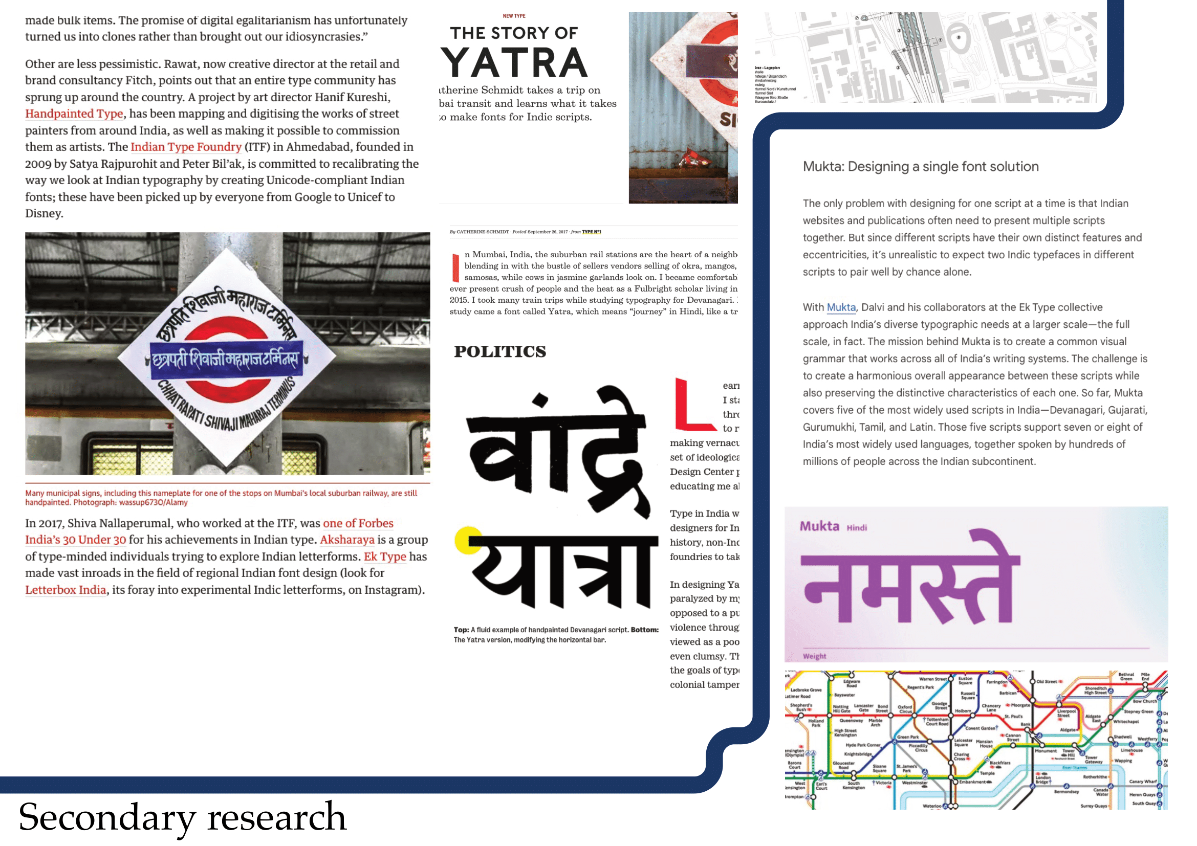
Secondary research especially in this project proved to be very fruitful in terms of what has been done so we don’t we arent uninformed about anything that has happened with regards to improving this.

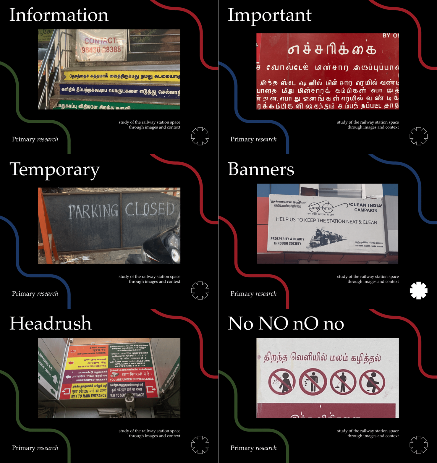
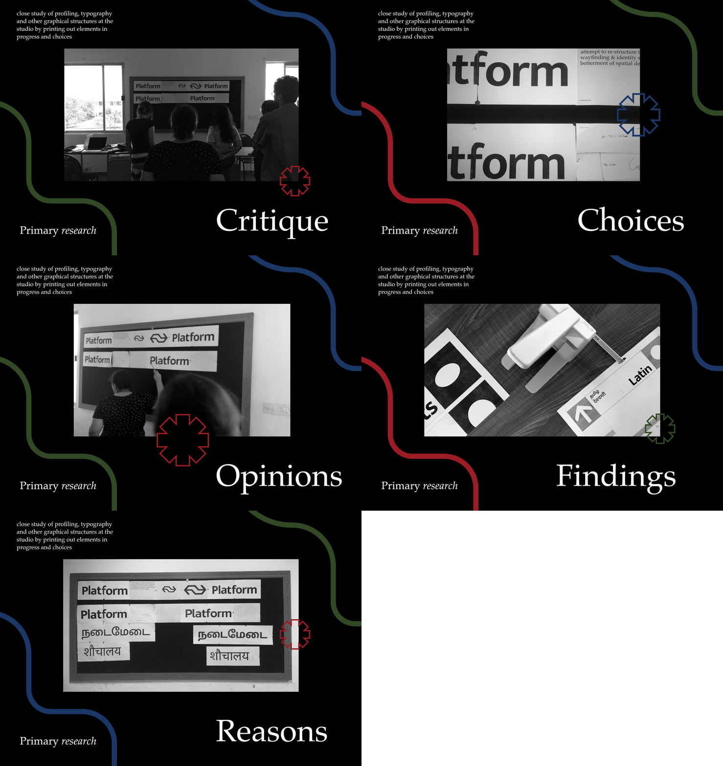
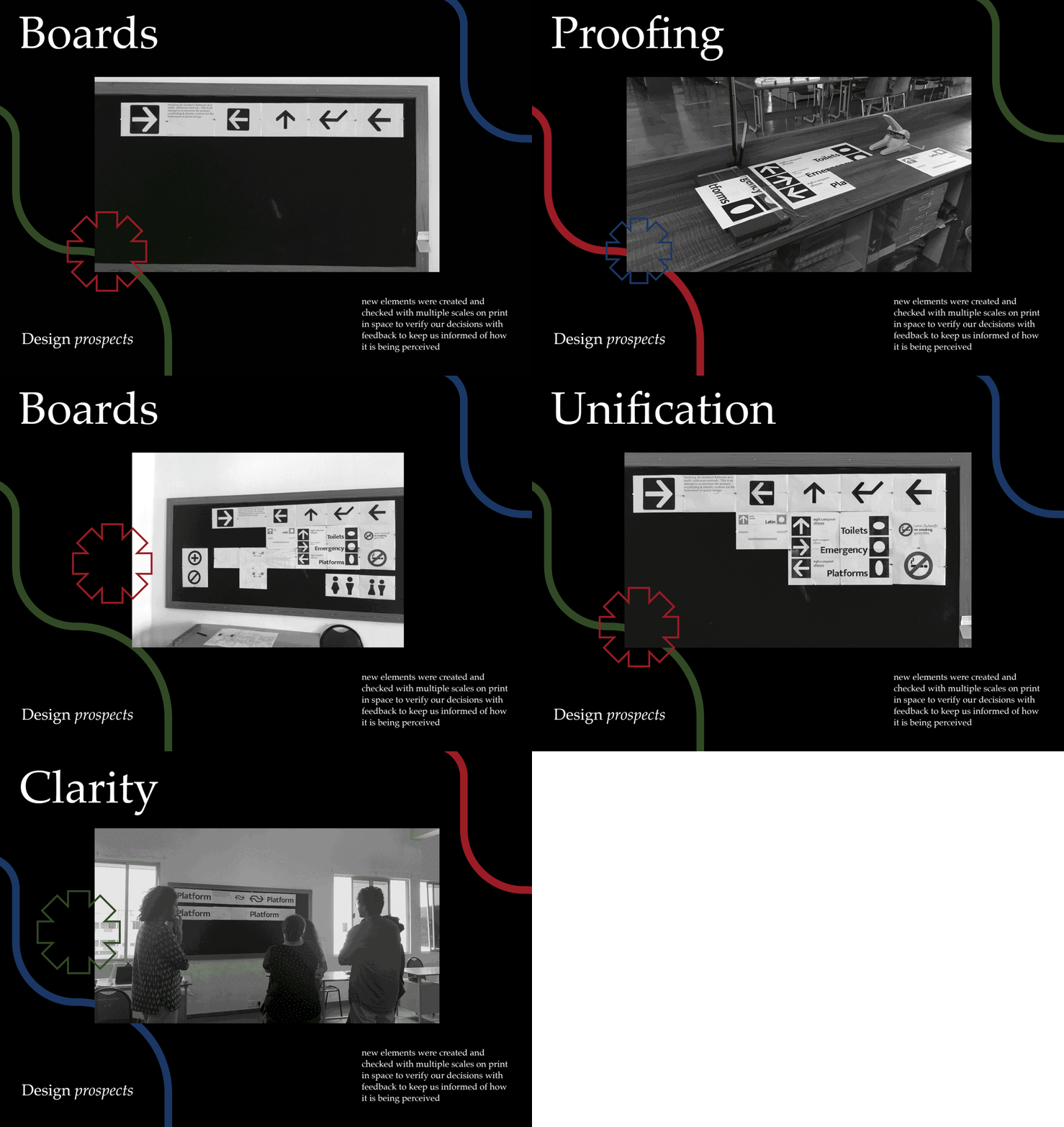
Primary research had two phases one in the studio were a small sampling universe was made to discuss certain ideas and giving feedback with what was put up as ideations and concepts
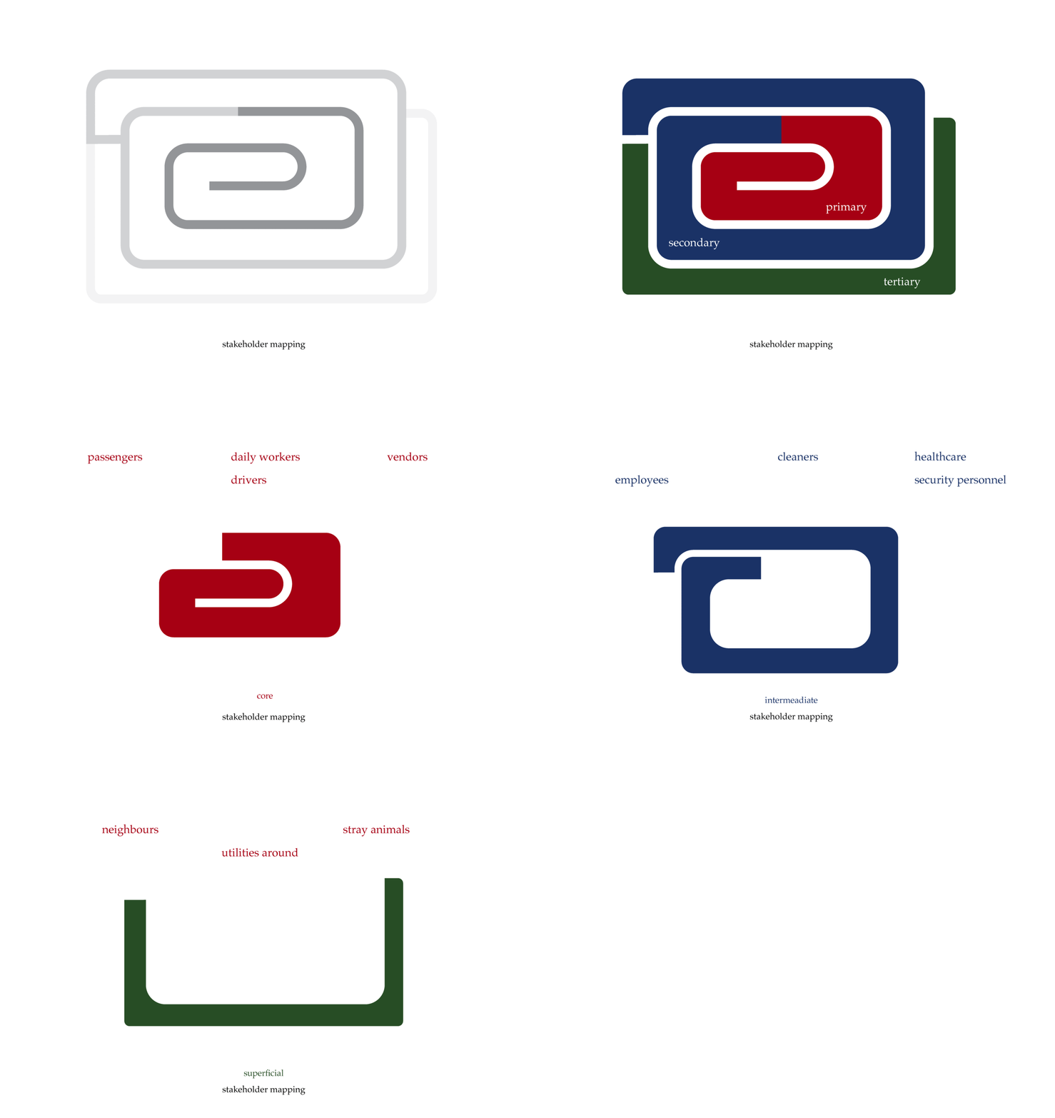
For a railway station quite literally everyone is a stakeholder, but to make it specific and centered towards a certain universailty, the stakeholder mapping was attempted to position exactly who gets affected by this.
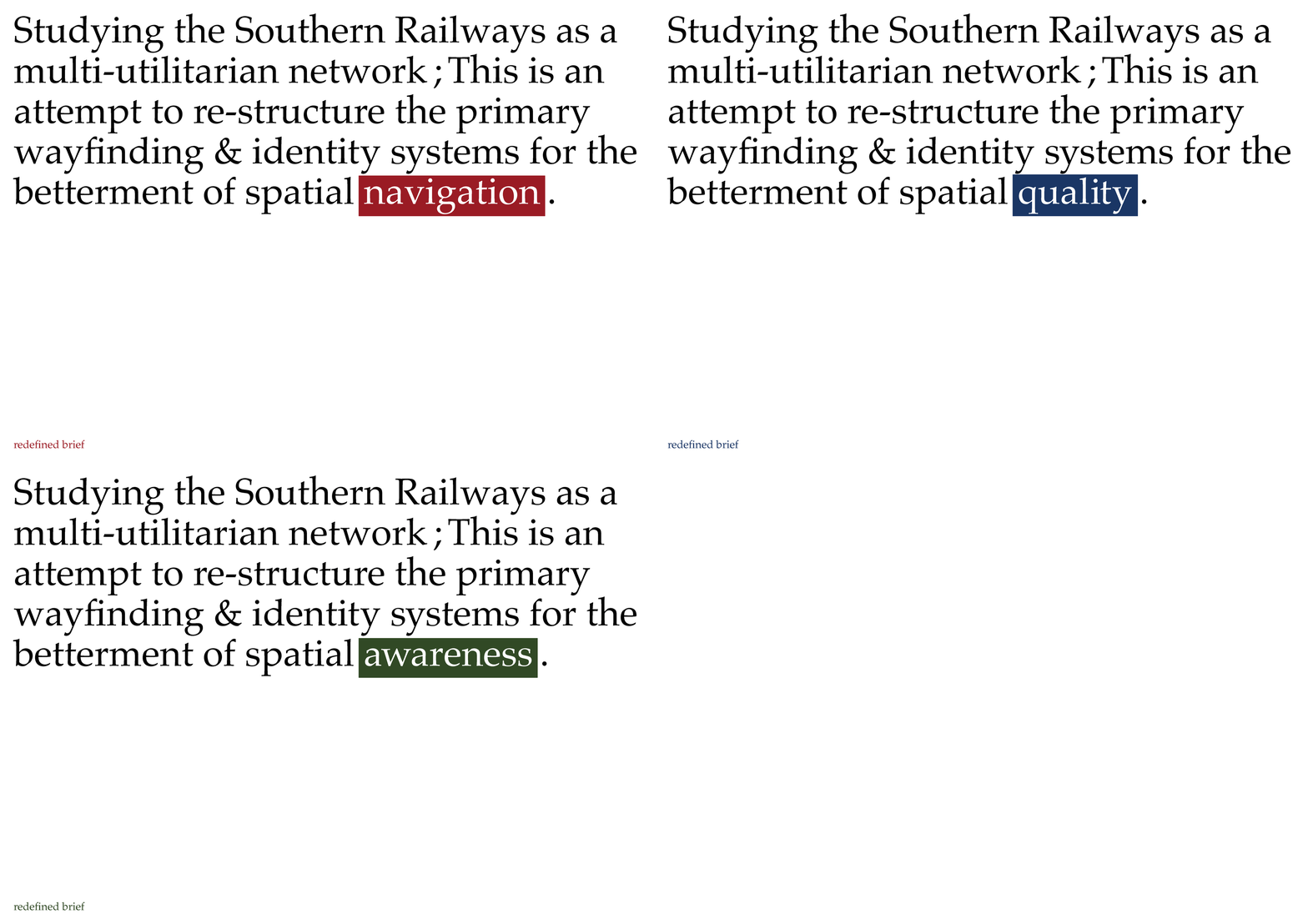
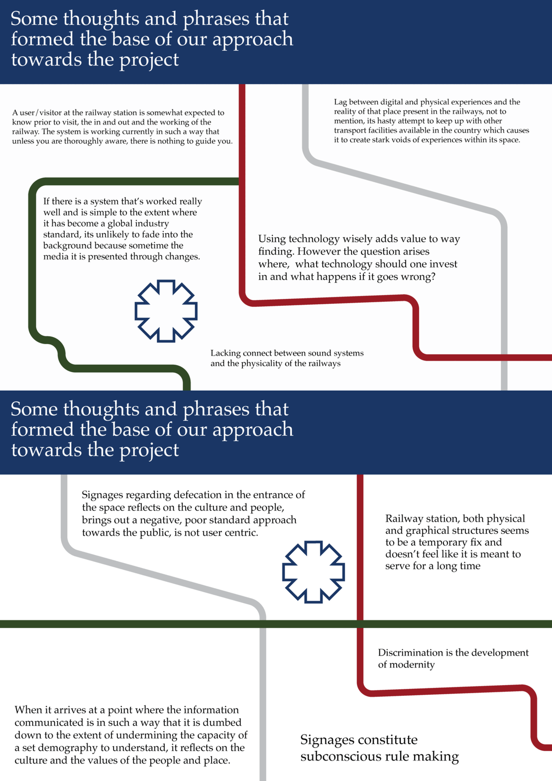
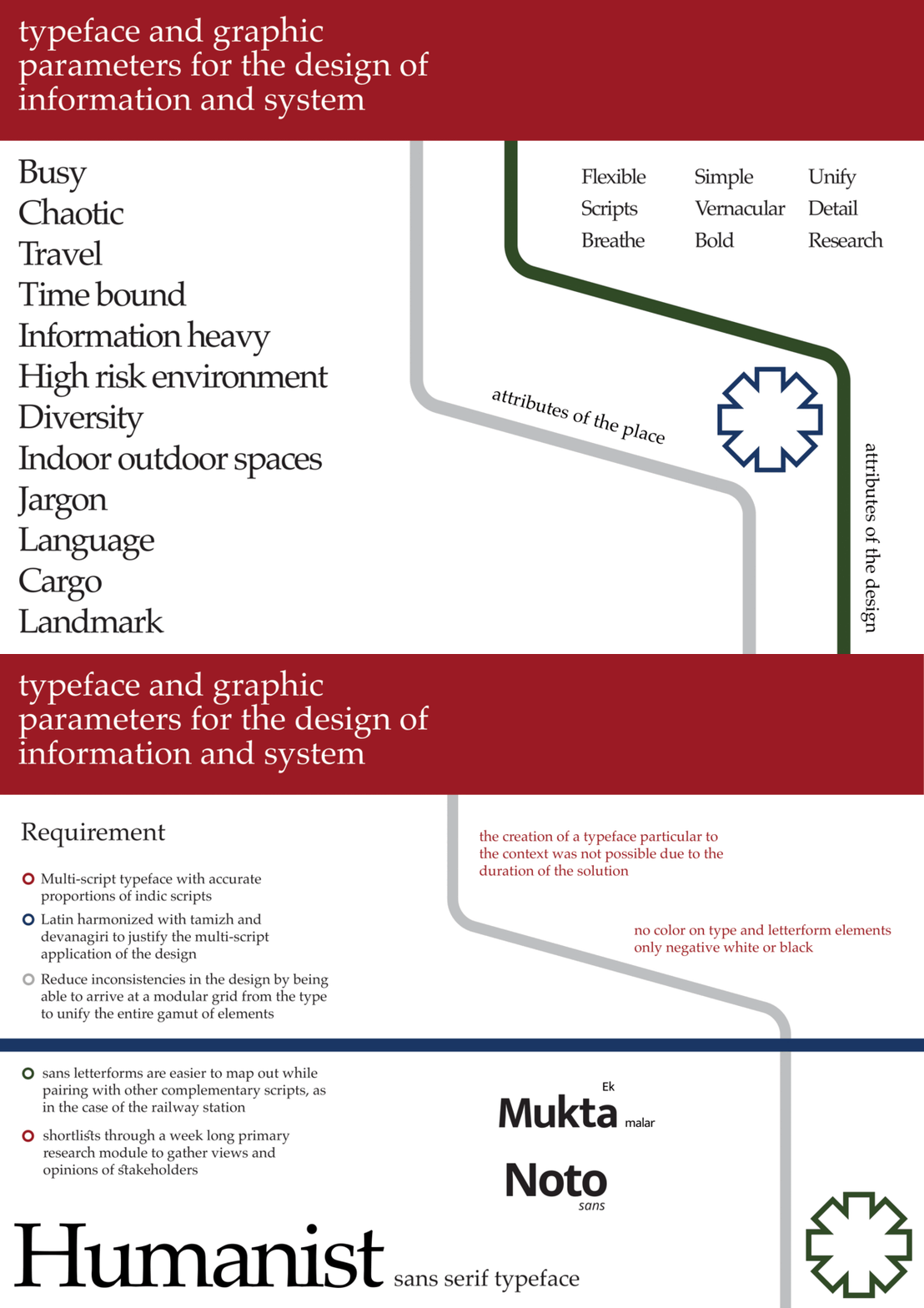


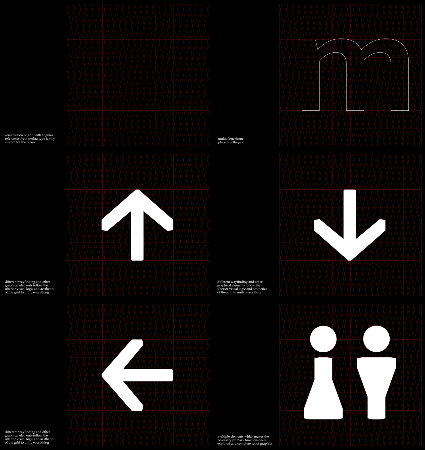
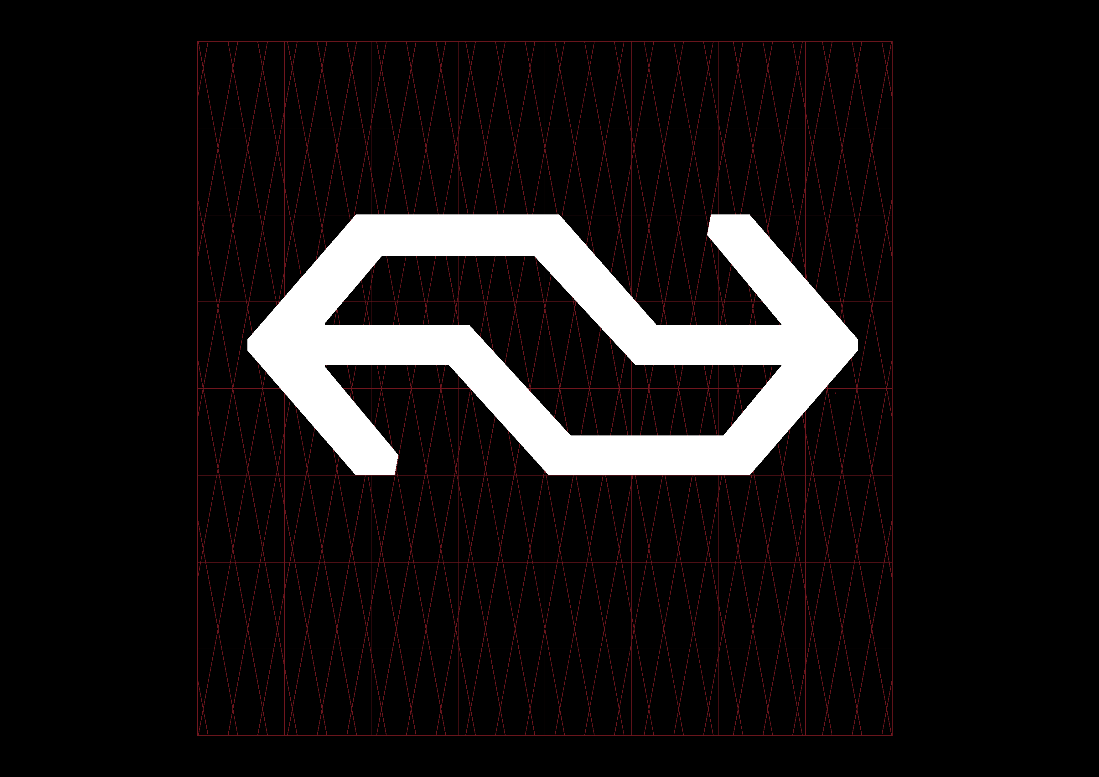

Wayfinding elements were all constructed keeping in mind the
need to harmonising supplementary graphics to that of the type
and in turn together.
need to harmonising supplementary graphics to that of the type
and in turn together.

The grid was given a lot of importance but even in the most apt case was always used as a guiding tool later some degree of visual correction was attempted in the very constrained time given.

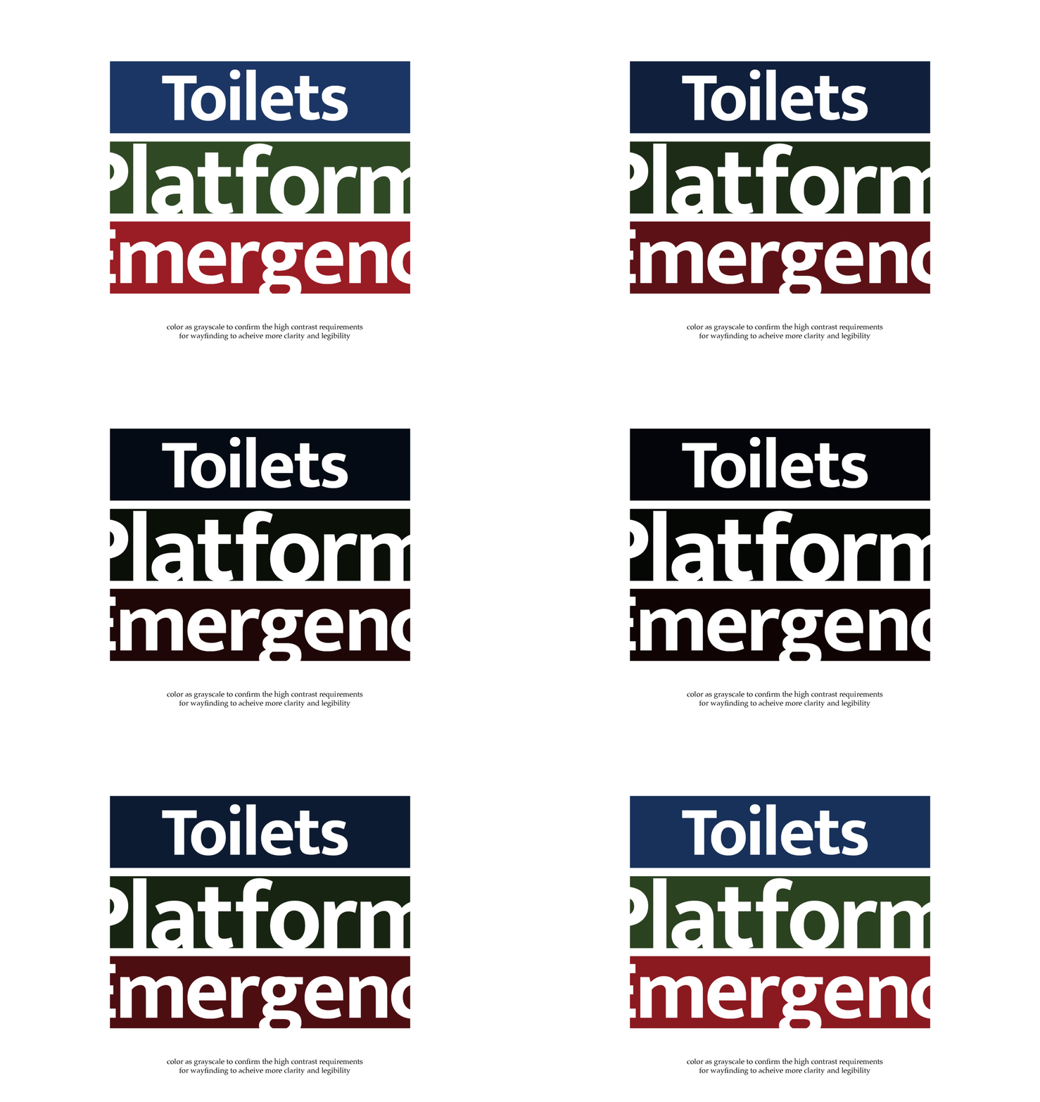
Color as navigation ought to be something which talks a lot about requirements because in this regard a very high contrast legibility is
very important since its part of space firstly, secondly it has multiple
different elements in the communication which needs a binding
factor for easier association
very important since its part of space firstly, secondly it has multiple
different elements in the communication which needs a binding
factor for easier association


The Flexible grid of sorts was ideated and arrived at, though simple in its outlook proves efficient as detailed below with different sized words being adapted without much problems.
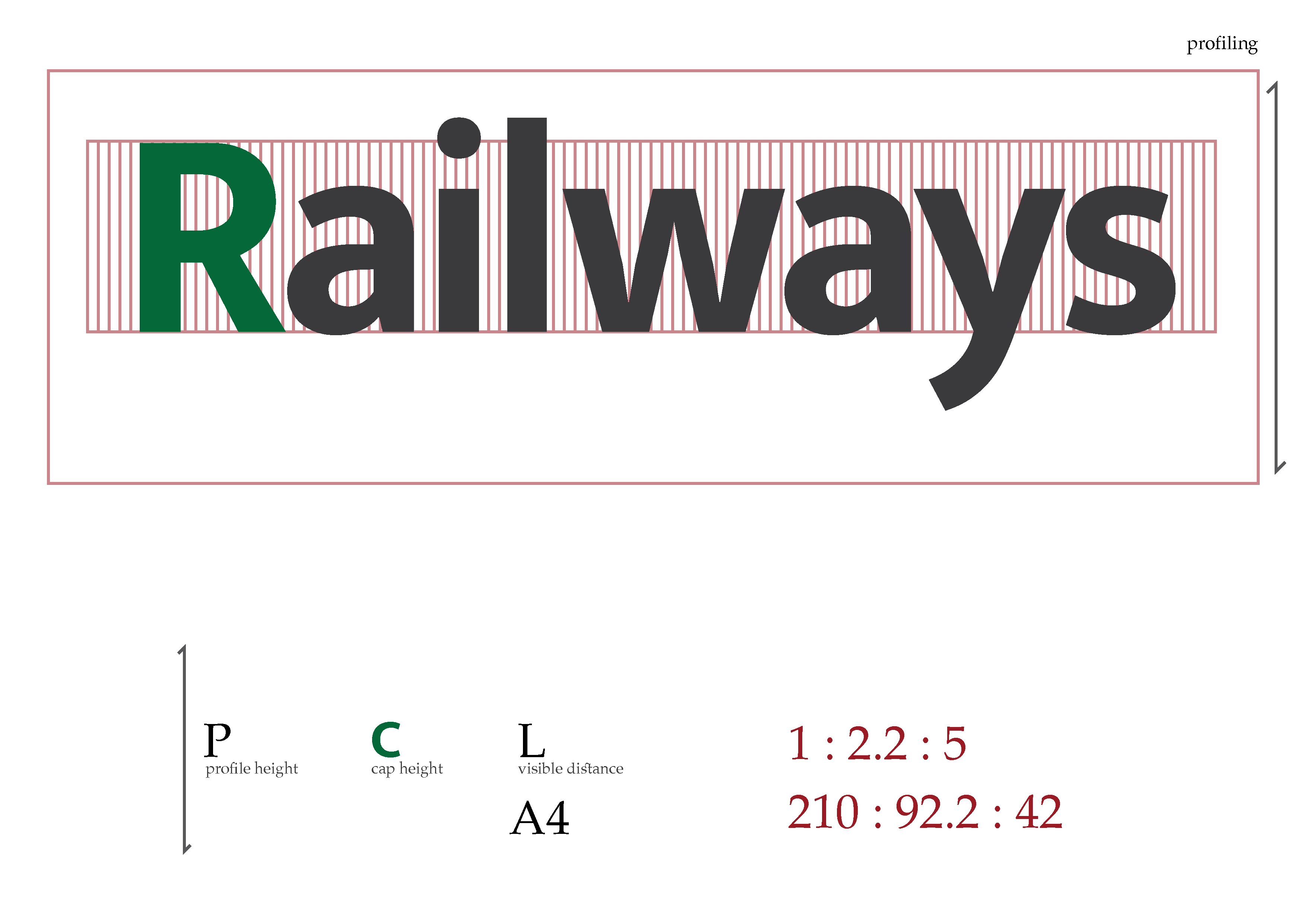

Since the ideology the project was approached with was reduction, the reductive elements were always kept in check for a better and clearer communication. The designs were then applied to a sketch to imagine one day a railway station with not much clutter and information pollution.


