DJAD Identity Design

DJAD is a design school commenced in 2004 owing to a felt need in the country, to offer design education in the Indian context. The ideology behind the school was developed with visits by the founder to NID, deeply influenced by the learning culture there he chose to set up an institution of same standards in the South of India.
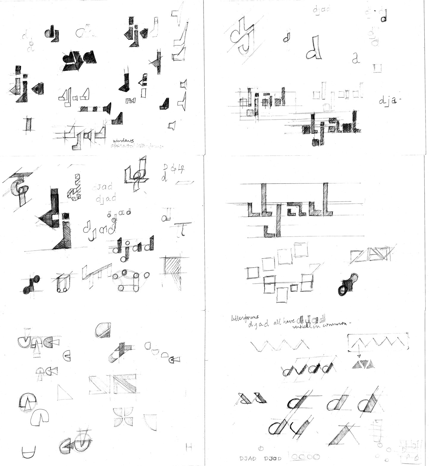
Designing the identity of an institution I am currently part of, even hypothetically, came with a lot of delibrations throughout the process. This documentation would present some of the choices and directions taken along the process of arriving at the final mark.
I started with an approach of defining my boundaries and giving myself constraints whether to take a symbolic or typographic direction. After the first round of ideation discussions it was evident that I should tackle with something that would capitalise on an existing jargon prevalent in the college which is referring to ourselves as ‘DJAD’ unanimously, it was rare that the entire student and the management body agreed on a lingo/acronym which I thought brings the entire college together on how we identify ourselves.
I started with an approach of defining my boundaries and giving myself constraints whether to take a symbolic or typographic direction. After the first round of ideation discussions it was evident that I should tackle with something that would capitalise on an existing jargon prevalent in the college which is referring to ourselves as ‘DJAD’ unanimously, it was rare that the entire student and the management body agreed on a lingo/acronym which I thought brings the entire college together on how we identify ourselves.
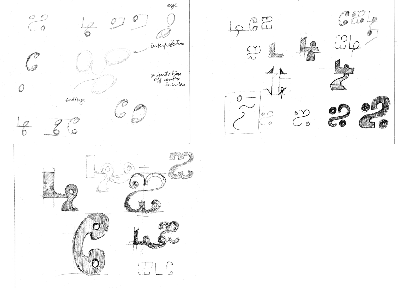
Though after agreeing to the direction of DJAD as the most defining characterstic, I tried to manifest them in the vernacular language to see if its possible to have a bilingual identity. I tried abstracting the letterforms of Tamil to its most fundamental characterstics trying methods of exaggeration and finding similarities between them. After discussions I did feel like it wasn’t the most appropriate to be the primary identity since most people couldn’t delineate if it reads something or if its a symbol.

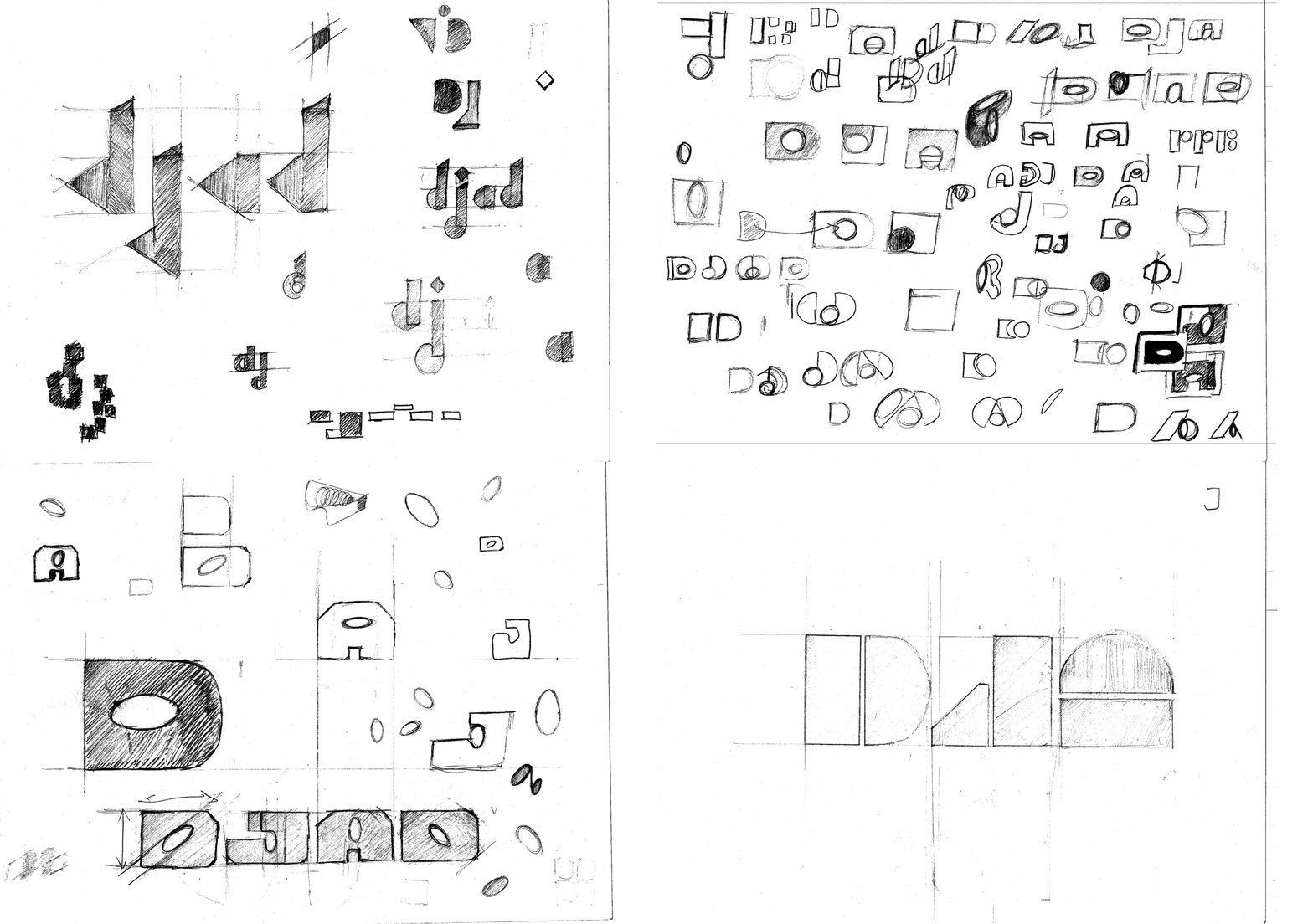
I took into consideration again, as I explored letterforms, the possibilities of infusing symbolism into them. But I was clear with the fact that I don’t want an overarching sense of developing the identity solely based on the trends currently. By that I mean a forced negative space intrusion or a hard attempt at pushing a concept into the letterforms. I tried one full fledged exploration where I explored the negative space of the letterform.
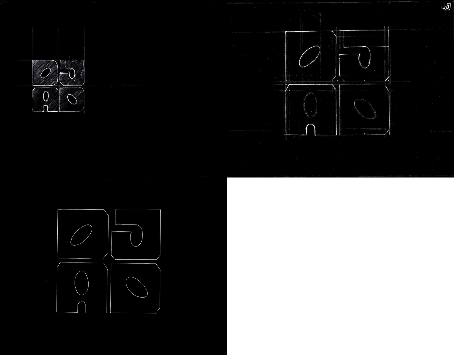
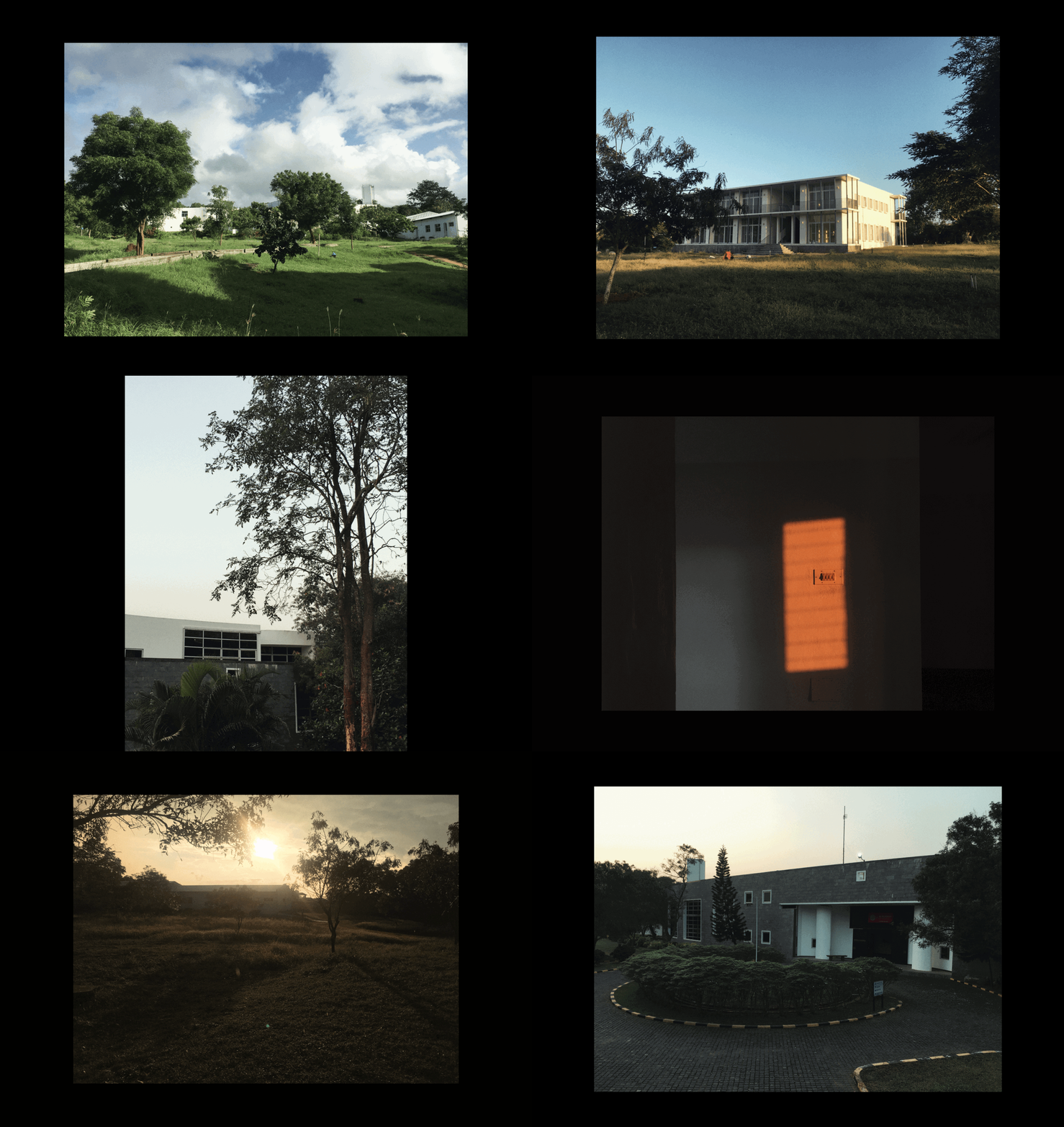
This exploration solely focuses on the elements around the campus trying to visualise a method to combine aspects of architecture and the motifs splurged around the structures. The primary element of attraction becomes the interaction of the geometric and natural forms which is again what I tried to develop in the forms simplified.
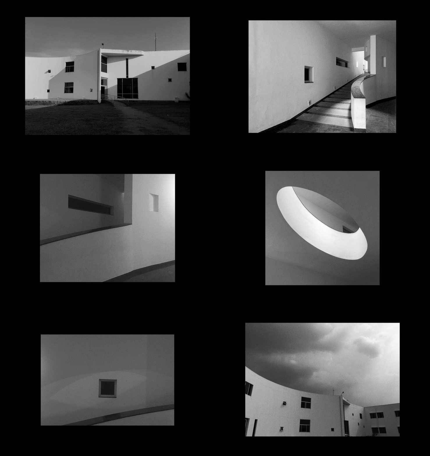
The Principal Architect of our college Ar.Rahul Mehrotra has cemented principles of Bauhaus and Modern interpretations of classical Indian architecture like the Gujarathi stepwell ‘Vaav’ which forms an open air amphitheatre which becomes the centre piece.
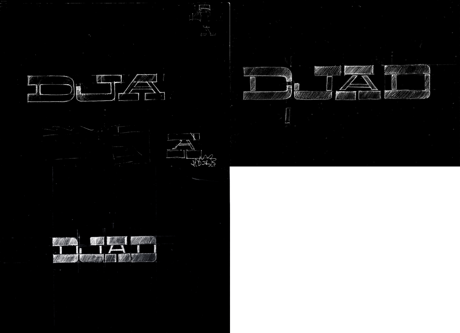
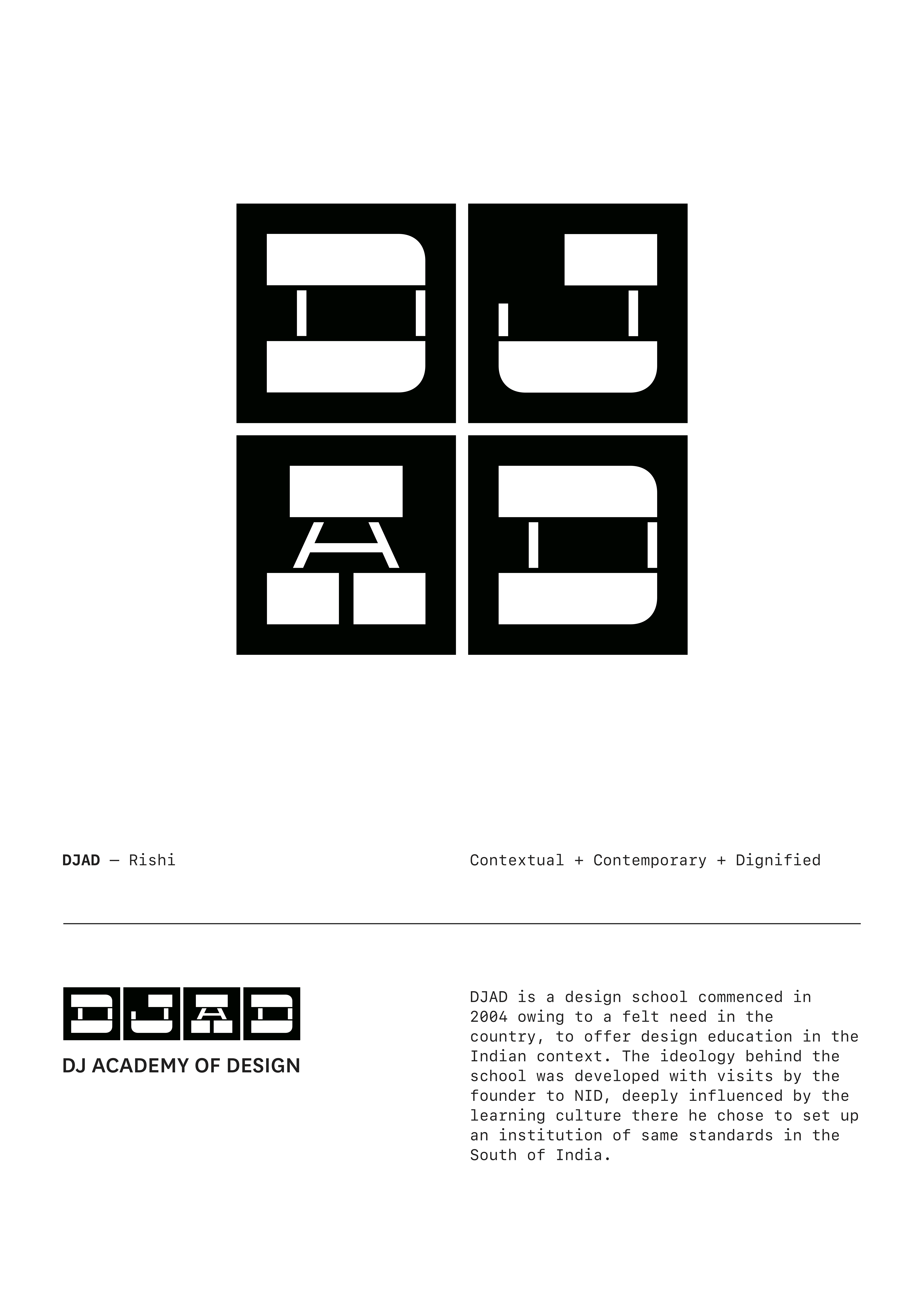
I approached the identity with a clear idea of manifesting the letters ‘DJAD’ as the spirit of the institution. I worked with trying to provide solutions which would be appropriate and timeless. I kept in mind the aspects of functionality while designing the mark taking to consideration the applications and the its usage at multiple touchpoints.
I looked at a multitude of slab serif’s in the starting to reference MICA and other institutions with the Heavy Slabs and some reverse stressed typefaces and identities. This direction led me to my final ideation of the basic letterforms which I then contructed digitally calculating the stem width and the spaces between the sections.
I looked at a multitude of slab serif’s in the starting to reference MICA and other institutions with the Heavy Slabs and some reverse stressed typefaces and identities. This direction led me to my final ideation of the basic letterforms which I then contructed digitally calculating the stem width and the spaces between the sections.

Larger changes where made to the proportions of the letters trying to harmonize the forms swiftly. The horizontally sectioned form gives a simplified outlook with the geometric rounding for the curves. Composition of the stems in the middle was key to the readability which was tested multiple times before finalising the letterform for further progress.
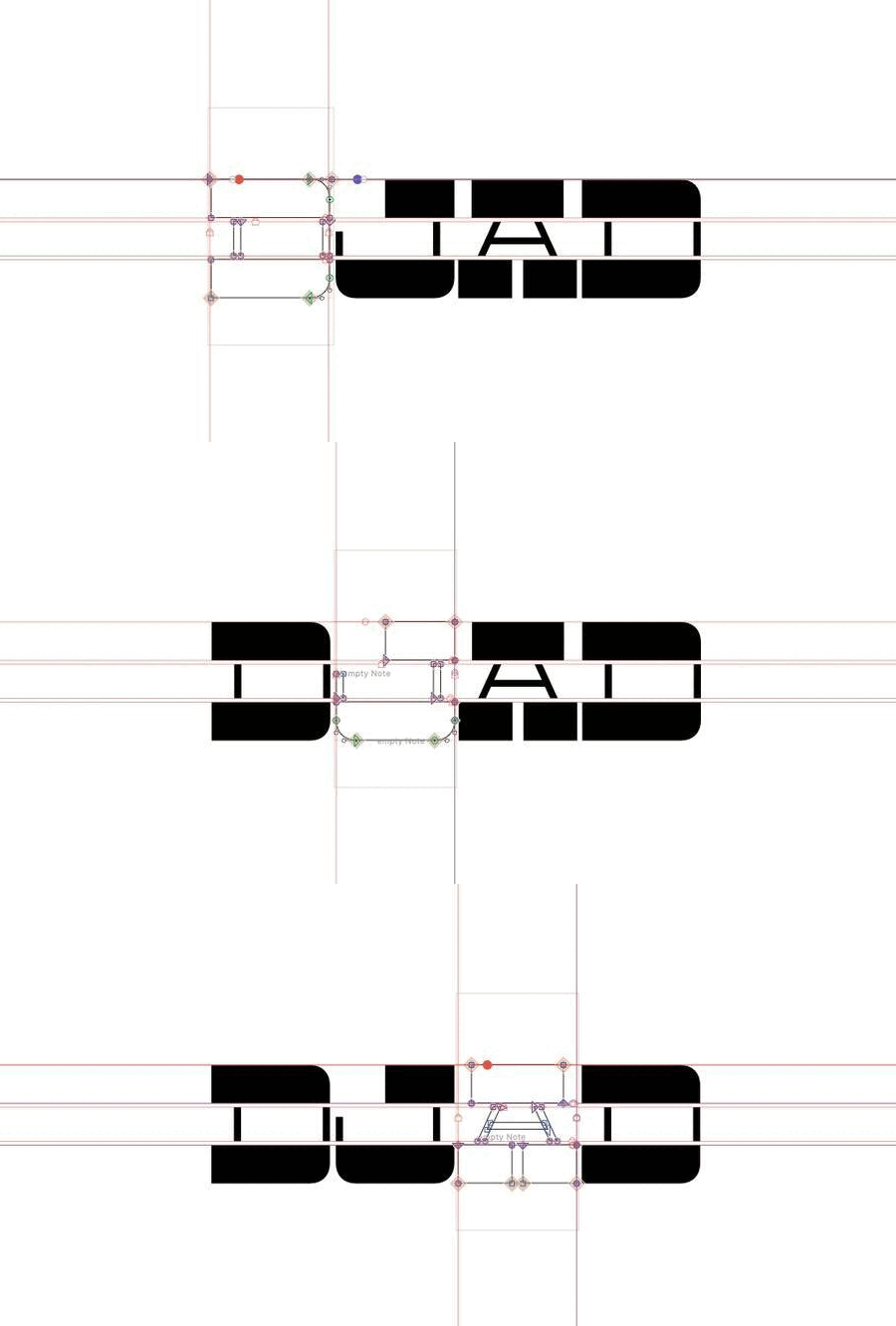
Each Letterform was visualised as a square to integrate it seamlessly with other elements and also as a way to dictate the aesthetics further to be the same.
The scales of the letterform was tested and printed for feedback and further smaller changes were made to refine the form.
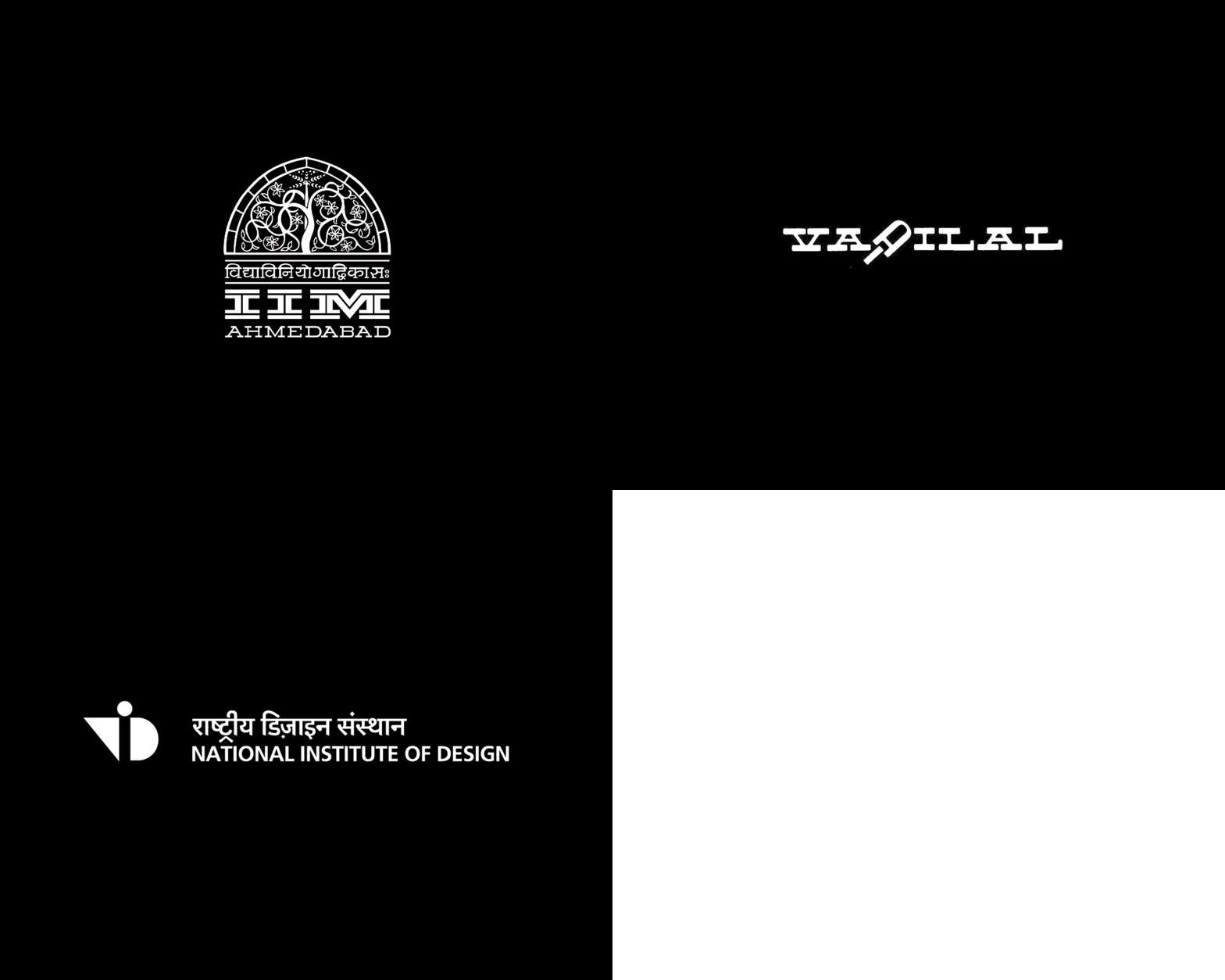
During the process of designing the identity there were a lot of influences of Indian design that helped meset a visual context to my idea. To point out some of them, I would start with the ‘Vadilal’ identity designed by Late Prof. Manu Gajjar , IIM Ahmedabad slab serif letterform and the mark of NID by Adrian Frutiger.
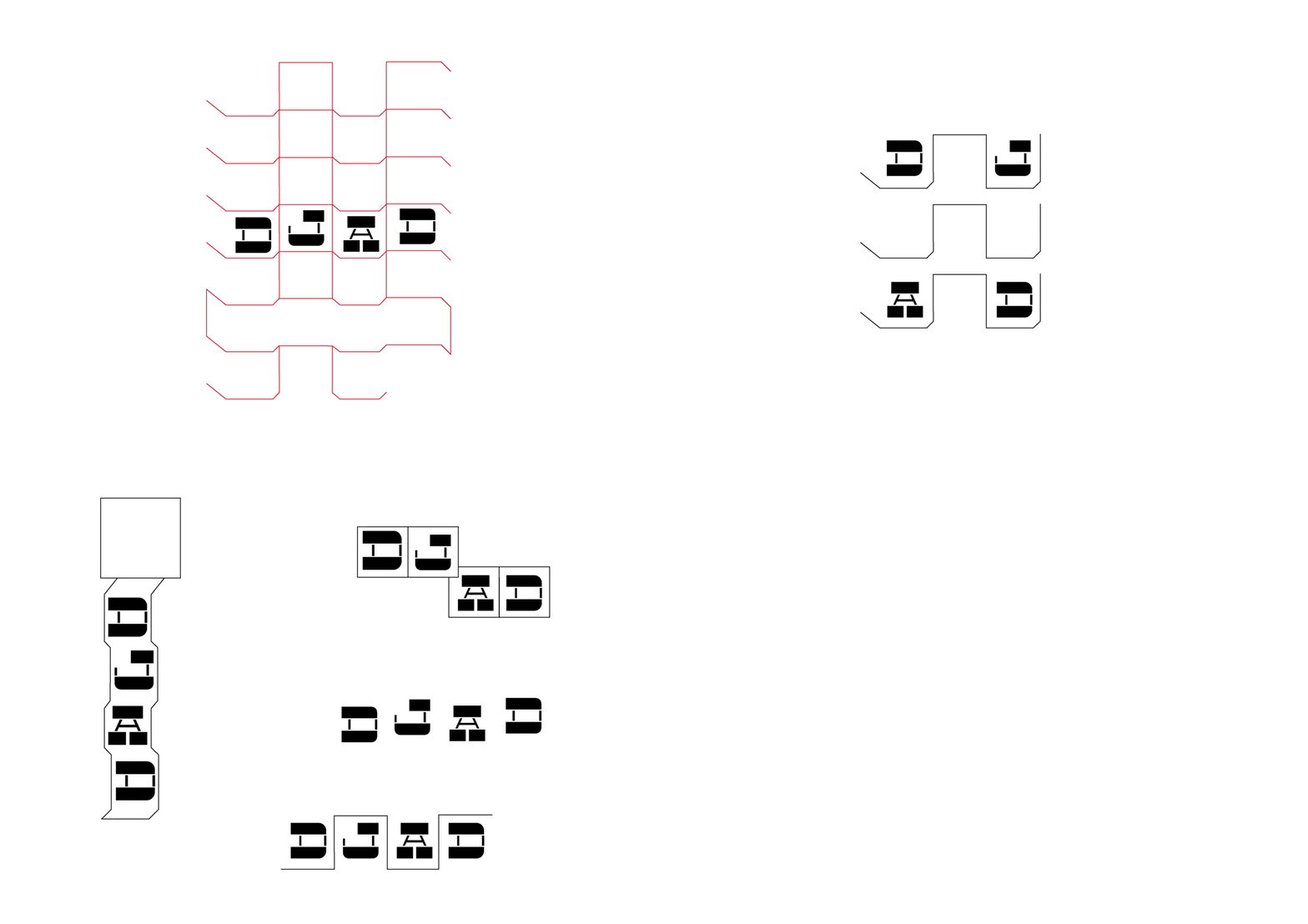
I tried to compose the four letters exploring multiple ways of arranging them as a striking identity trying to stack and various other frames.

Modular identity was what I wanted it to perform as, as something which can work in multiple orientations / formations and also identifiable even as a single cell
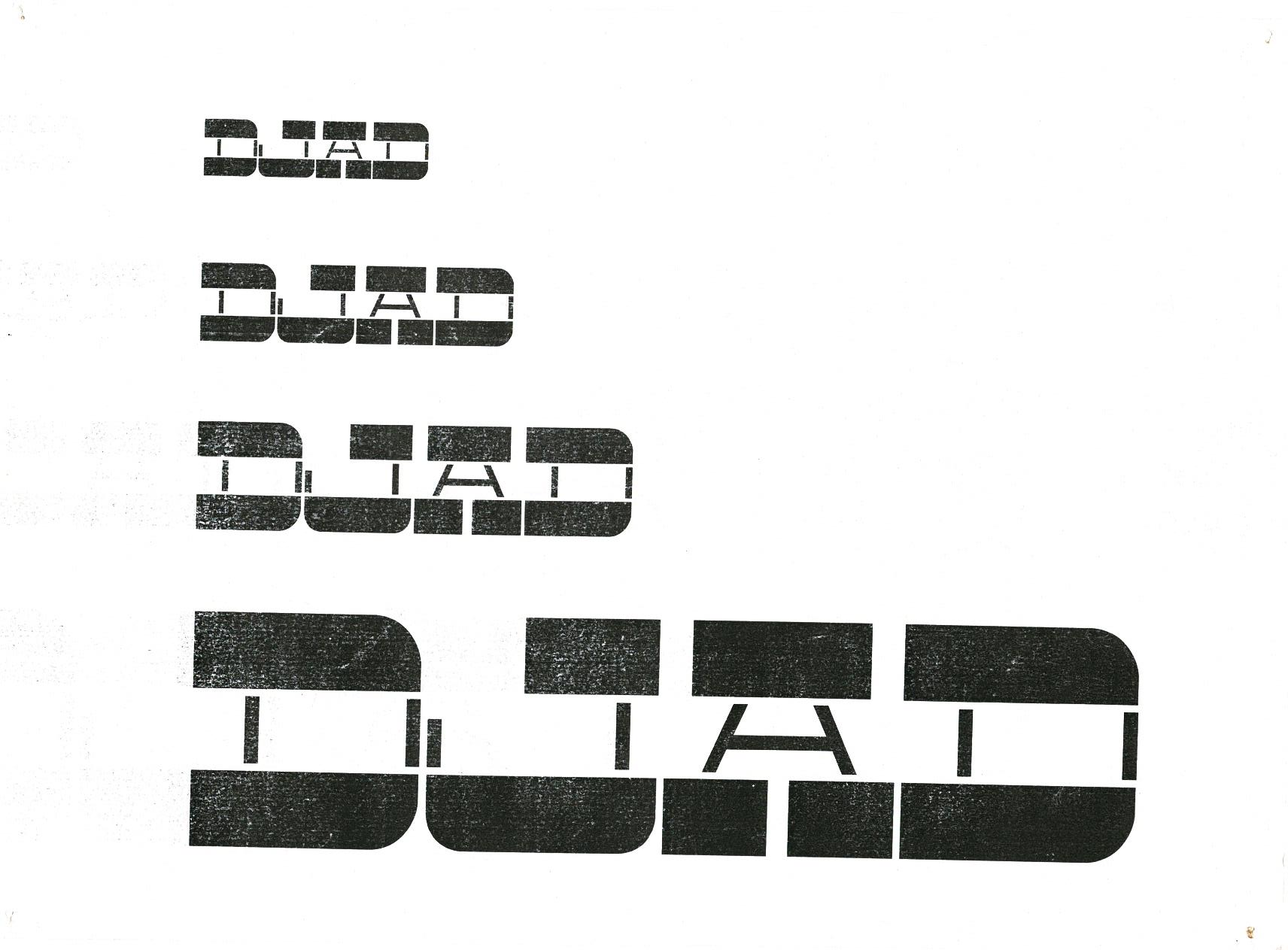
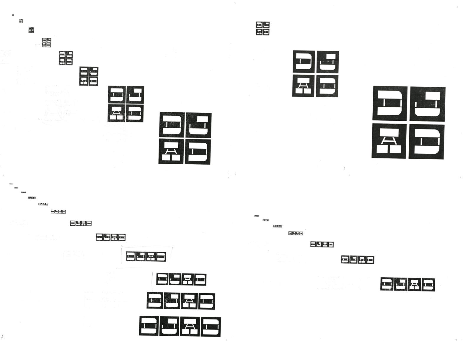
The definition of both the letterforms and the harmonizing squares was checked in multiple scales and sizes. It was noticed that beyond a certain scale there was loss of definition in the identity, so another drawing of the letters were made for smaller point sizes and defined as a guideline.
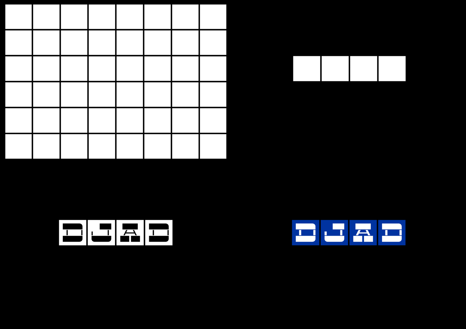
Yves klein international blue which was developed by the artist was used as a distinguising color from the black and white also because of wanting to keep it simple and timeless in its usage and for it to adapt into and from lot of diverse applications.
RGB : 0,51,160
CMYK : 100,75,0,0
Pantone :286
RGB : 0,51,160
CMYK : 100,75,0,0
Pantone :286
The iterations and the sculpting of the forms to produce the character and traits was expected to create something identifiable with a discerning quality, This led to me thinking that an identity is character and traits of ‘something’ dictated by form and upheld by function.
I tried to keep an informed practice of working with the intent of producing an identity with a focus on refinement & sophistication.
Thanks Parimal !
I tried to keep an informed practice of working with the intent of producing an identity with a focus on refinement & sophistication.
Thanks Parimal !