Lalbagh Botanical Garden



Santiago Orozco is a Type Designer and Engineer, based in Monterrey, Nuevo León, México who made Josephin Sans. The idea of this typeface is to be geometric, elegant, with a vintage feeling, for use at larger sizes. It is inspired by geometric sans serif designs rom the 1920s.
The x-height is half way from baseline to cap height, an unusual proportion,the sharpness of the edges gives it an added character. I felt that tackling this project would require such a typeface which can be both aesthetically challenging and a workhorse.

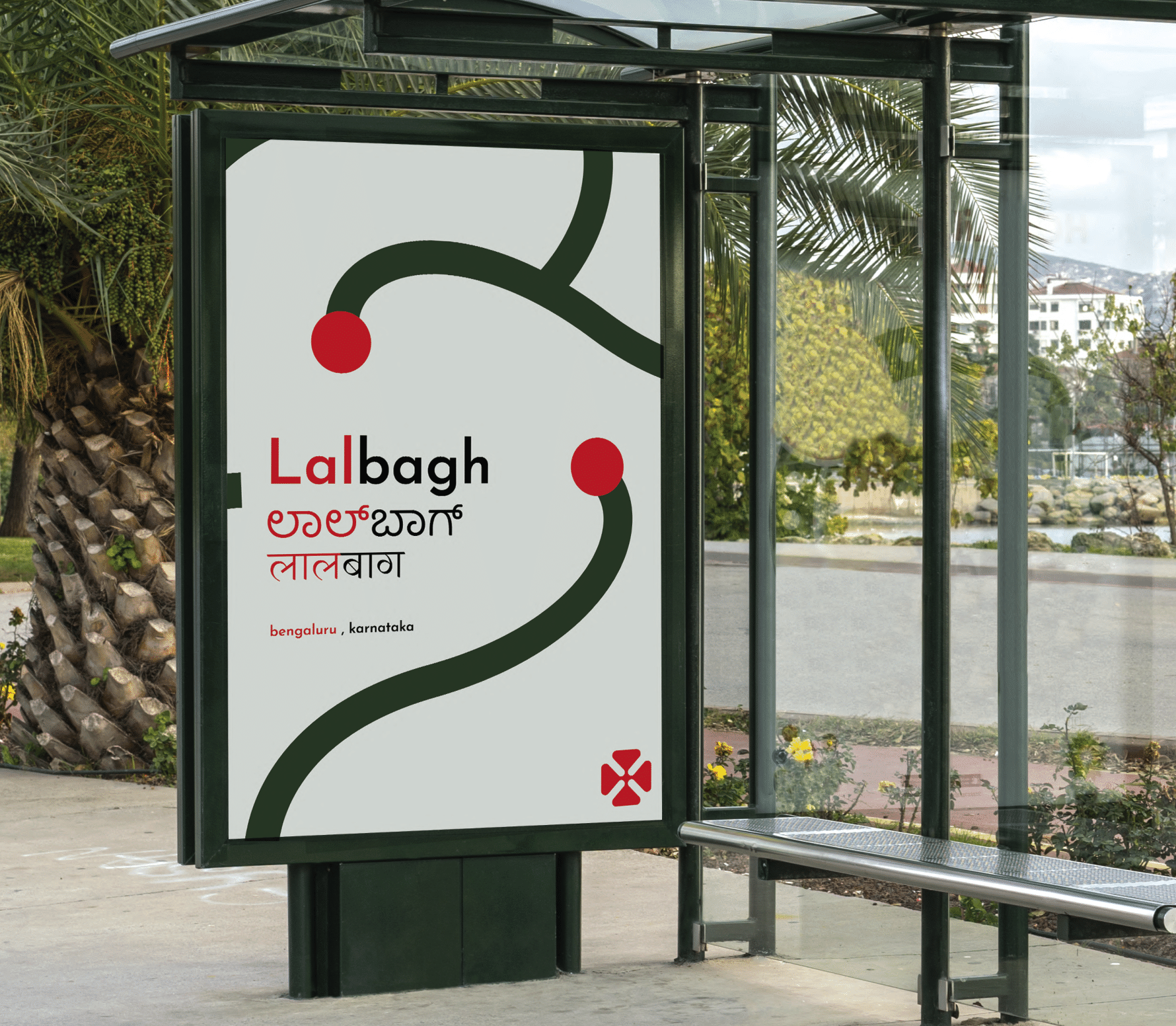
Lalbagh has always been in association with color and culture of bengaluru making it a highly recognizable landmark. Though the colors were pciked and tested only digitally, further prototyping is required to be sure.
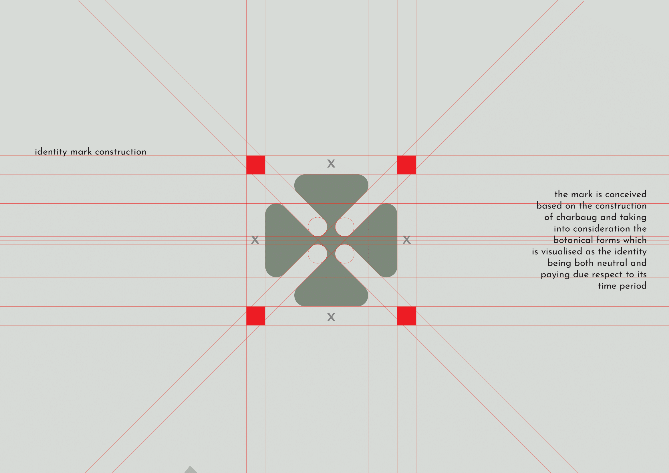

The identity mark was arrived at after a few explorations keeping in mind the idea and the appropriateness both in terms of form and its application.

a laser cut prototype was made as a visualisation of the design to ensure the correctness of the graphic and critique for further refinement if any.


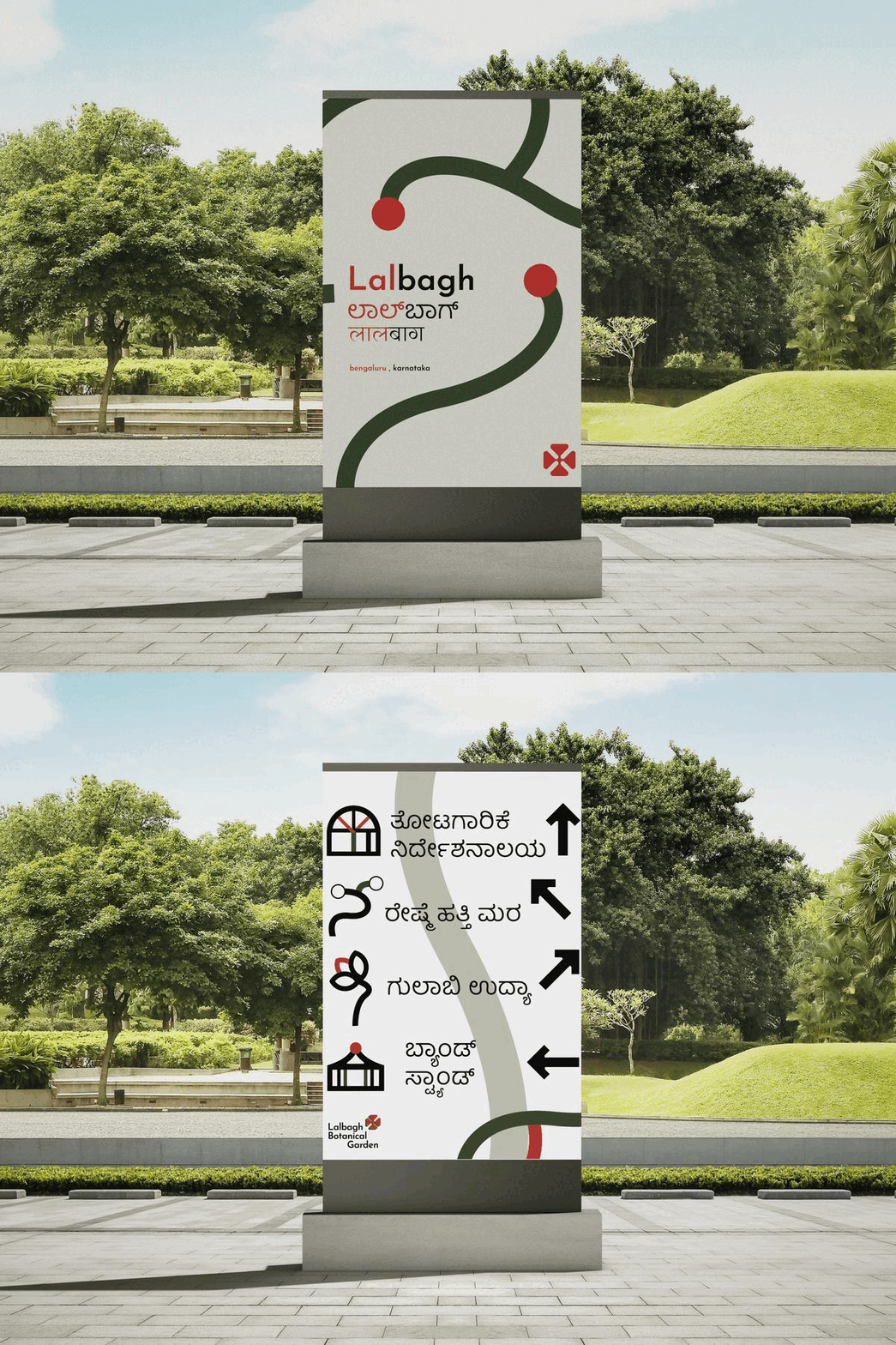
The kanada script has curvy letterforms which especially the way baloo tamma was constructed with the original proportions but at the same time does not take itself too seriously which compliments the geometric Josephin sans
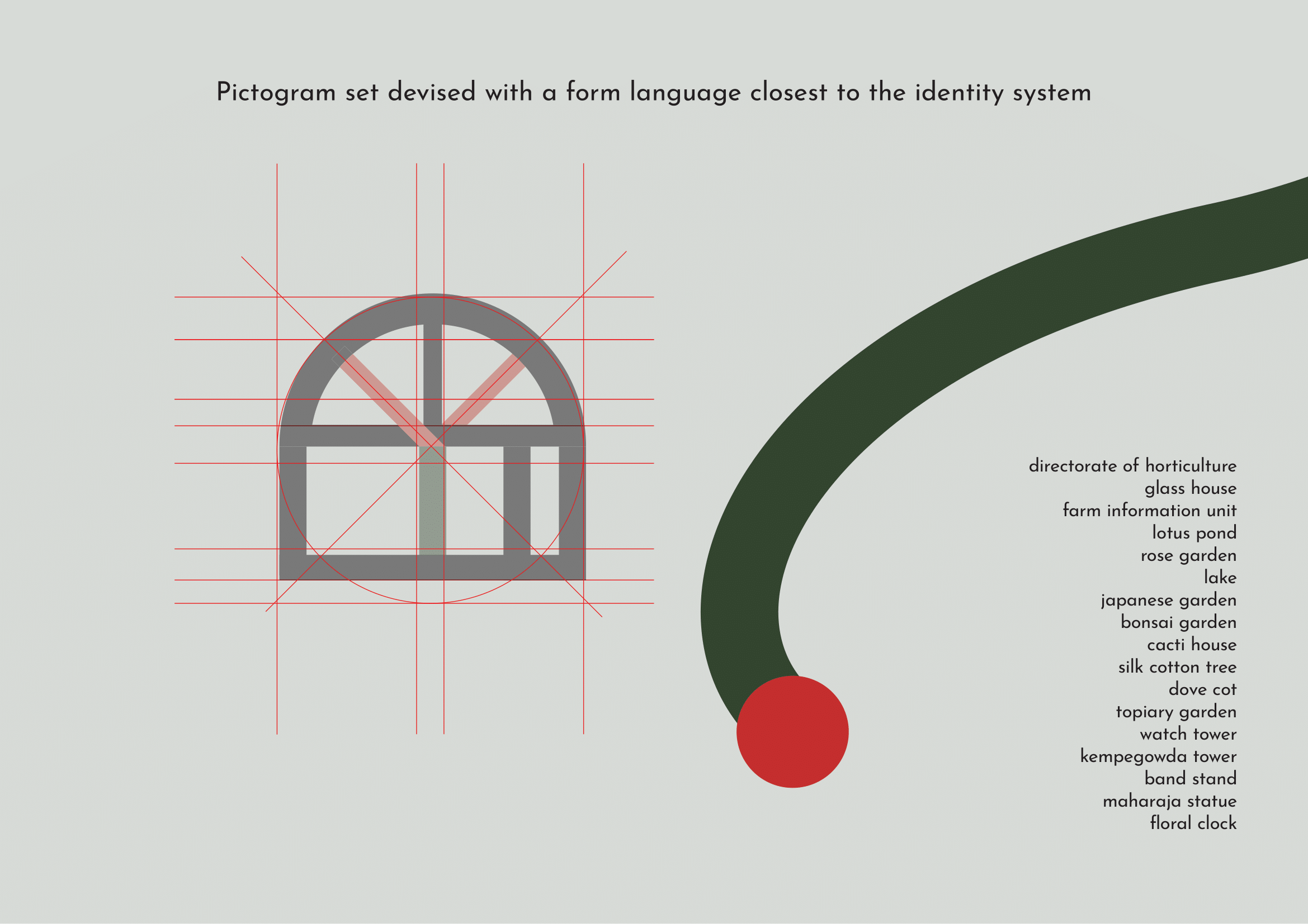
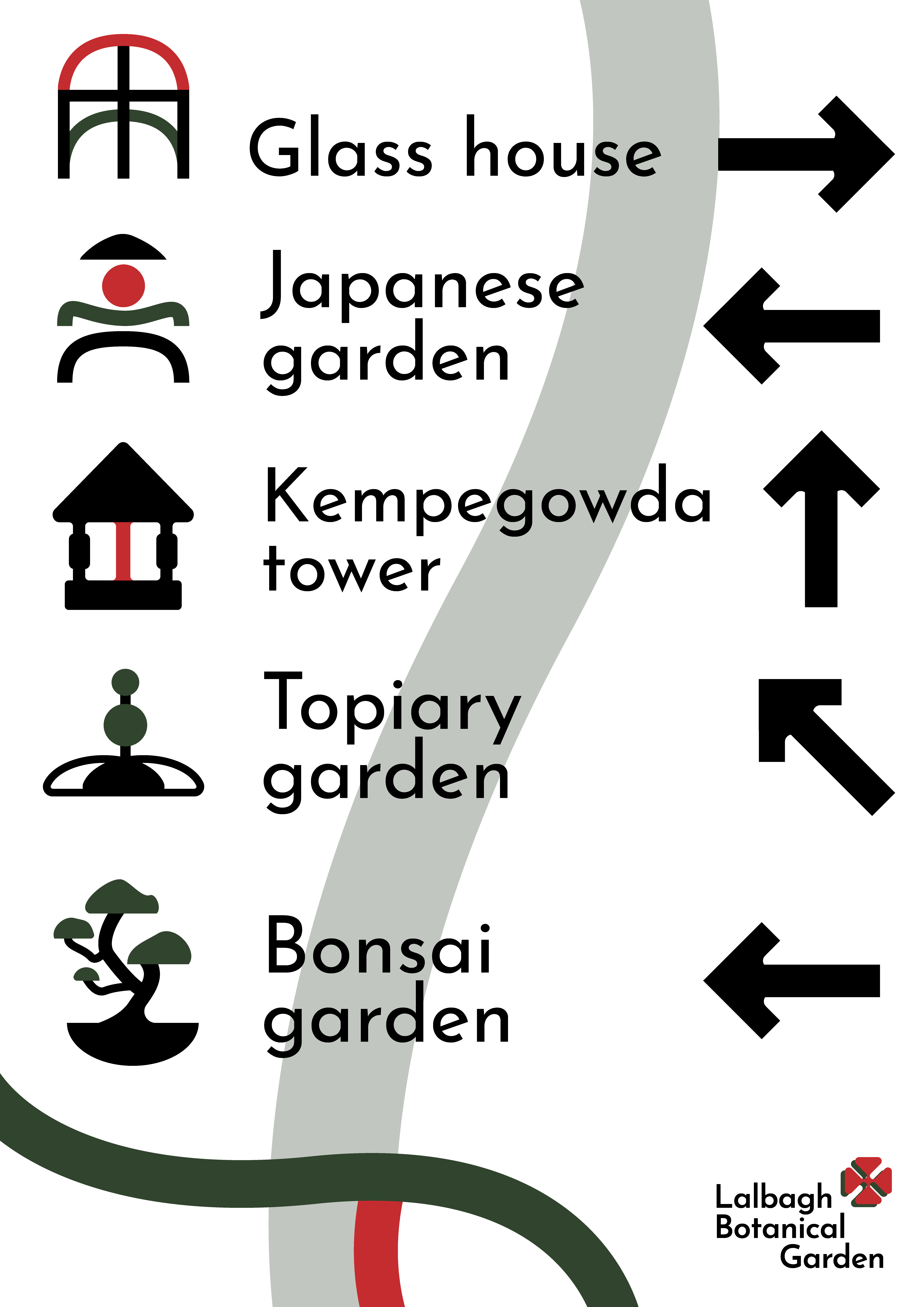
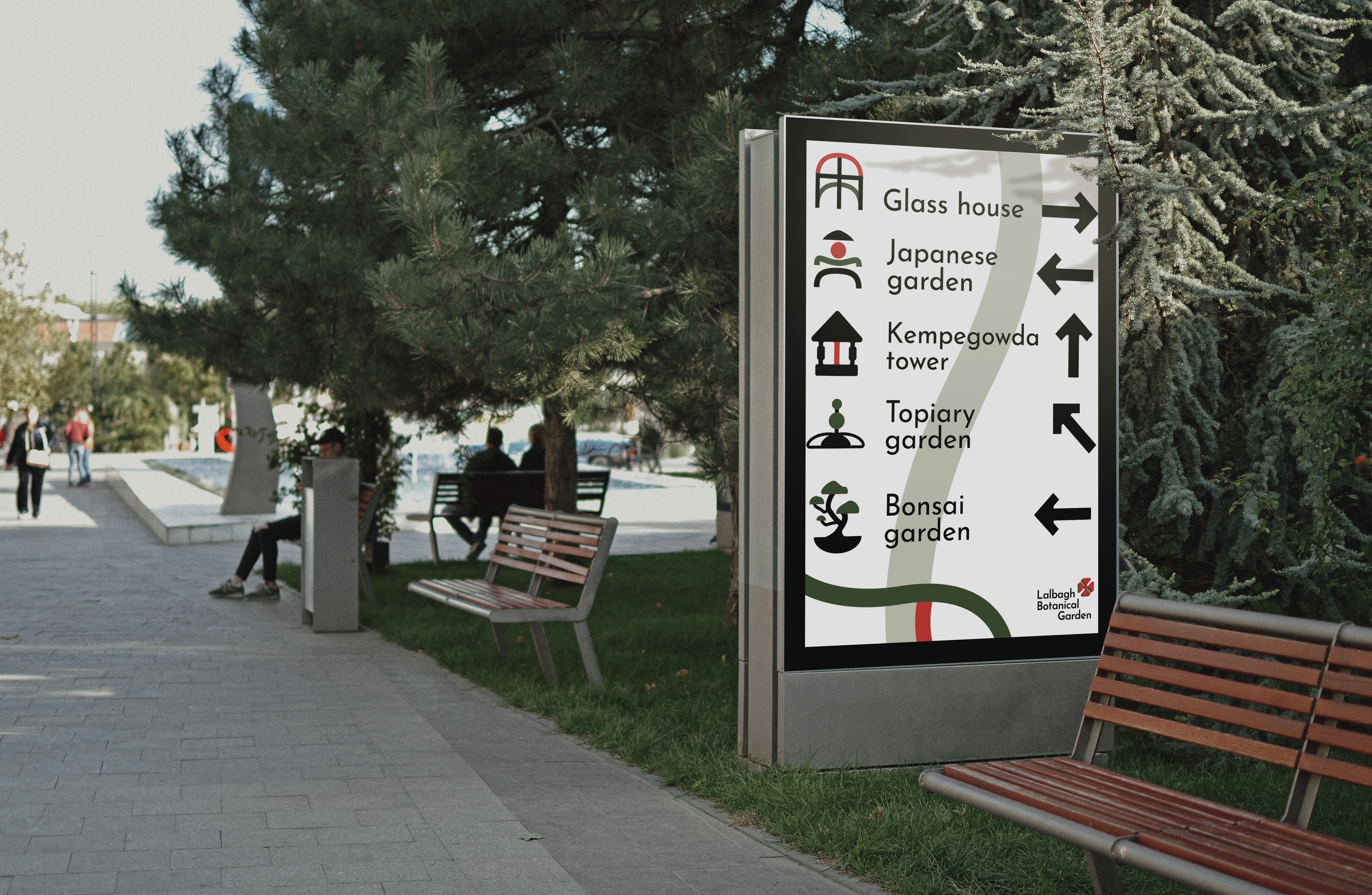
A basic grid was constructed to match the weights and build a consistent set of icons to solve certain problems of identification inside the garden

The set of graphics were all ideated from scratch and I attempted to create some consistency to harmonise them with each other first, and secondly try to balance all elements together


Guided by : V.K Jagannathan ( IDC-IITB)