Surulle packaging identity

Surulle was the outcome of a hypothetical packaging identity project with a brief to create the elements of packaging and build a cohesive series of renders to support the aesthetics of the brand.


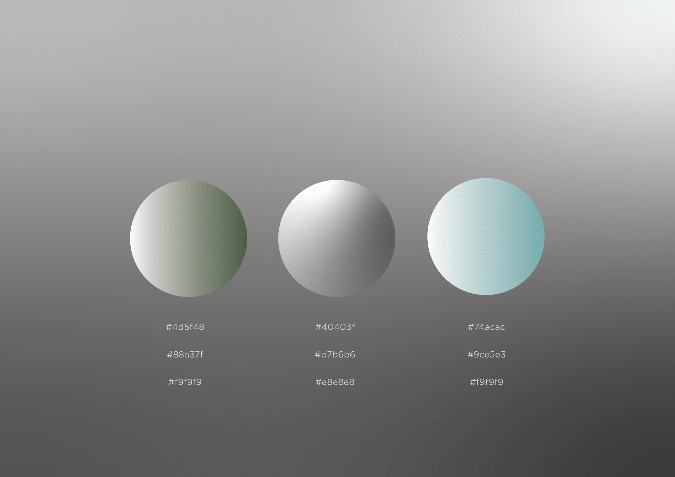
I made some bottle renders and some image browsing to get the mood and tone of the brand that I am envisioning. Some words were then made to adapt and inform the graphical ideas.


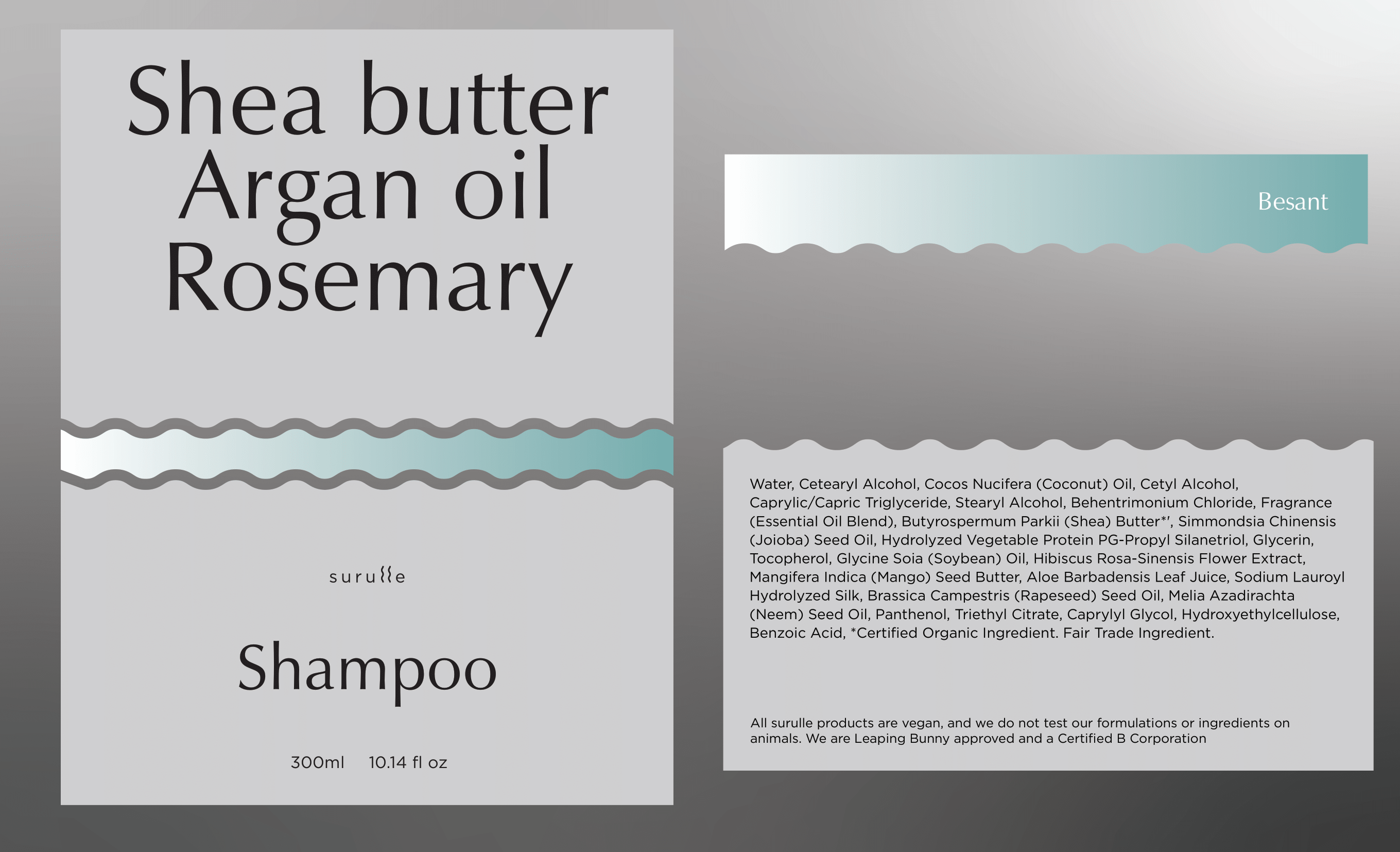
The labels were given some thought with respect to its application and the way it has a hierarchy in communication. In this regards I wanted my main ingredients in highest proportions to be the face of the product so people know exactly what they are paying for and by that way building trust.

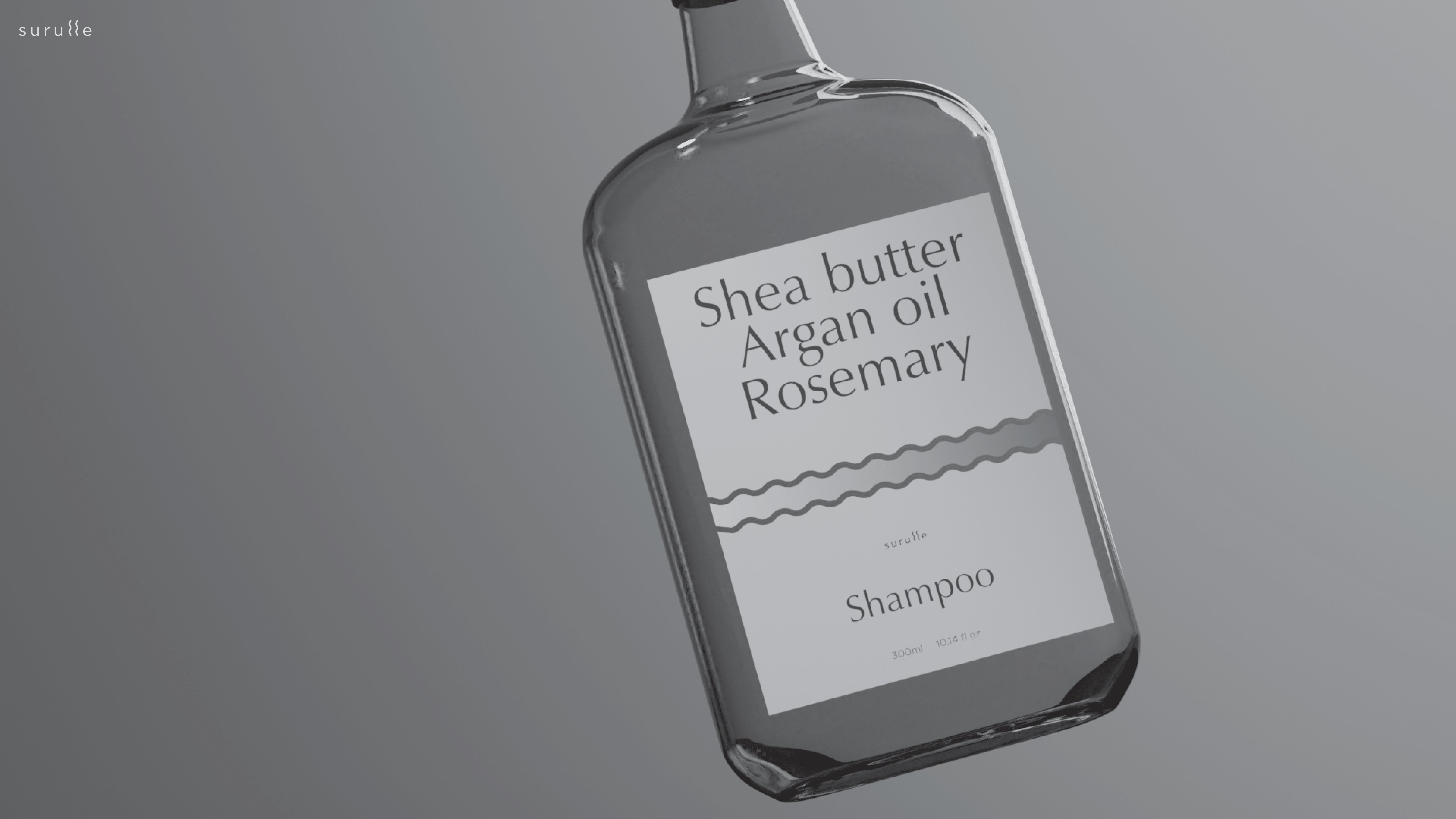
a few renders supporting the visual language and for the visualisation of the packaging graphics


